Inspiration
Bold stair runners: Embracing maximalism and impact
The staircase is the spine of the home. Why settle for a neutral transition when you can make a definitive statement? Bold runners are about confidence, colour, and creating a memorable vertical landscape.
Written by the StairRunner.co editorial team · Updated 4 September 2026
Defining 'Bold' in Stair Design
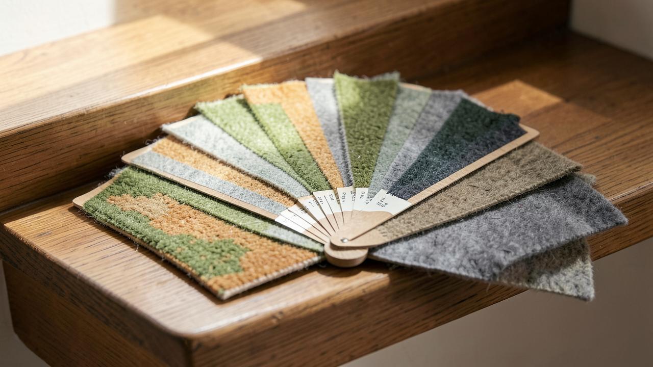
'Bold' is a subjective term, but in the context of interior design, it refers to choices that command attention. On a staircase, this usually manifests in three ways: colour, pattern, and texture. A bold choice isn't just about being 'loud'; it's about being intentional. It’s the difference between a floor covering that blends into the background and one that defines the room's character. In a hallway, which is essentially a thoroughfare, a bold runner acts as a signature, telling anyone who enters exactly what the aesthetic soul of the house is like.
For many homeowners, the stairs are the perfect place to experiment. Because you don't 'live' on the stairs in the way you do a living room or bedroom, you can afford to be more daring. A pattern that might feel overwhelming in a four-walled room often feels 'just right' as a vertical strip of energy in a hallway. It provides a burst of character that you experience in transit, making the journey between floors an event in itself.
Pattern Scale and Rhythms
The scale of a pattern is just as important as the pattern itself. On stairs, the pattern is broken up by the ninety-degree angles of the steps. A large-scale floral or geometric print will look different when viewed from the bottom of the flight (where you see the risers) than from the top (where you see the treads).
- Large Scale: Great for creating a 'pathway' feel. An oversized leaf print or a wide, multi-tonal stripe can make a flight feel grander and more expansive.
- Medium Scale: Animal prints (leopard, cheetah) or classic damasks work well here. They provide enough detail to be interesting but aren't so large that the pattern is lost on the steps.
- Small Scale, High Contrast: A tiny dot or star pattern in black and white can be incredibly bold due to the contrast, creating a shimmering, textured effect that hides small marks brilliantly.
Rhythm is also a factor. A pattern with a 'vertical' lean—stripes or climbing vines—will make the staircase feel taller. A pattern that is more 'all-over' or 'scattered' will make the staircase feel like a solid block of colour, which can be very effective in large, open-plan hallways.
The Psychology of Colour in Transitional Spaces
Colour sets the emotional tone of a home. A bright red runner can feel energetic and welcoming, while a deep teal or emerald green offers a sense of sophistication and calm. When choosing a bold colour, consider the lighting. Stairs are often tucked away from windows, and a dark, bold colour can 'die' if not properly illuminated.
| Colour Group | Mood Produced | Best Paired With |
|---|---|---|
| Primary Brights (Red, Yellow, Blue) | Energetic, warm, playful, and assertive. | White woodwork and simple lighting to allow the colour to speak. |
| Deep Jewels (Emerald, Sapphire, Plum) | Luxurious, grounded, moody, and expensive-looking. | Gold hardware and dark wood treads for a classic feel. |
| High-Contrast Monochromes | Architectural, sharp, modern, and high-fashion. | Minimalist décor and glass balustrades to emphasize the lines. |
| Earth Tone Bolds (Terracotta, Ochre, Rust) | Nurturing, tactile, organic, and grounded. | Natural wood and plenty of greenery for a biophilic design. |
| Neon or Acidic Accents | Contemporary, edgy, and high-energy. | Concrete or industrial finishes in modern loft apartments. |
Balancing Bold Patterns with Architecture
A bold runner doesn't exist in a vacuum. It interacts with the banister, the spindles, the wall colour, and the floor at both ends. If you have an ornate, Victorian balustrade, a very busy pattern on the stairs might create 'visual noise'. In this case, a bold, solid colour with a contrasting border might be more effective than a complex print.
Conversely, in a modern home with simple glass or steel railings, a wild, multi-coloured pattern can provide the necessary warmth and character that the space might otherwise lack. Think of the runner as a piece of art; it needs 'white space' around it to breathe. This is why many successful bold installations feature plenty of exposed timber on either side of the carpet. The margin of the tread acts as a buffer between the intense pattern of the runner and the rest of the room.
Durability of High-Contrast Prints
One practical benefit of bold patterns is their ability to hide wear and soiling. A flat, pale beige carpet shows every footprint and speck of dust. A bold, multi-coloured pattern is much more forgiving. This makes it an excellent choice for households with children or pets where keeping a pristine look is a constant battle.
However, be mindful of the material. If you choose a bold design in a low-quality synthetic, the colours may lack depth and can appear 'plastic' under bright lights. Wool remains the best medium for bold colour, as the fibres absorb dye deeply and retain their vibrancy for decades. The natural lustre of wool also prevents bold colours from looking 'flat'. Learn more about material choices in stair runner materials.
Maximalism on the Flight: Mixing and Matching
The maximalist trend—more is more—is perfectly suited to stair runners. This might involve clashing a striped runner with a floral wallpaper, or choosing a runner that features five or six different colours. The key to successful maximalism is a shared 'anchor' colour. If the runner and the walls share even one shade of blue or green, the space will feel curated rather than chaotic.
Don't forget the risers. Some bold designs are 'face-to-face' woven, meaning the pattern is consistent throughout. Others might allow for a decorative 'border' to be used on the risers while the treads remain plain. This is a sophisticated way to introduce boldness without the full commitment of an all-over print. You can also experiment with different border widths to increase the 'boldness' of the edges.
Stripe Theory: Vertical vs Horizontal
Stripes are the most common bold choice, but how you use them matters. Vertical stripes (running up the stairs) create a sense of infinite length and height. They lead the eye directly to the top of the flight. Horizontal stripes (running across each tread) are much rarer and more difficult to install, but they can make a narrow staircase feel much wider.
Multi-tonal stripes—where a dozen different colours are used in varying widths—are a staple of bold British design. They are particularly effective because they contain so many colours that they can be matched to almost any wall paint or décor change you make in the future. They are the ultimate 'future-proof' bold choice.
Animal Prints: A Timeless Bold Choice
Leopard, cheetah, and zebra prints are often dismissed as 'fad' items, but in the world of stair runners, they are surprisingly timeless. A leopard print runner functions as a neutral because it contains browns, blacks, and tans, but its pattern is undeniably bold. It adds a layer of texture and 'cool' that few other patterns can match.
When using animal prints, keep the rest of the hallway simple. Black handrails, white walls, and a single statement light fixture allow the animal print to be the star. These patterns also have the added benefit of being incredible at hiding pet hair and everyday grit.
The Impact of Stair Shape on Bold Patterns
Not all stairs are created equal. A straight flight is the easiest place to use a bold pattern. As soon as you introduce winders or a spiral, the pattern will start to 'turn'. With a bold stripe, this means the stripes will converge on the inside of the turn and spread out on the outside.
For some, this geometric distortion is part of the charm. For others, it’s a dealbreaker. If you have a complex staircase, a 'random' bold pattern (like a marbled effect or a small-scale scatter print) might be easier to live with than a rigid geometric one. If you are determined to have a geometric pattern on a winder, be prepared to pay for a 'mitred' installation.
Safety and Visual Cues
There is a safety aspect to bold runners. A high-contrast design makes the edge of each step very easy to see. This is particularly important for the elderly or those with visual impairments. A runner that is too close in colour to the stairs themselves can lead to 'step blurring', where it's hard to tell where one tread ends and the next begins. Bold borders are excellent 'cues' for the feet, providing a clear boundary for each step. Read more on stair safety.
Professional Installation for Complex Patterns
We cannot overstate the importance of professional installation for bold, patterned runners. If a stripe is even slightly crooked, it will look like the stairs themselves are leaning. If a large geometric pattern doesn't line up across a landing join, the whole effect is ruined. Pattern matching is an art form that requires patience and precision.
When interviewing fitters, ask to see photos of their work with large-scale patterns or stripes. A good fitter will plan the 'drop' of the pattern so that it sits attractively on every step. They will also advise on how much extra carpet you need to order to ensure the pattern can be matched correctly—often an extra 10-15% is required. See installation methods for more details.
Evolving the Space Around the Runner
Once your bold runner is installed, you may find the rest of the hallway needs an update to keep up. Consider painting the handrail in a dark, glossy finish to ground a vibrant runner, or adding large-scale artwork that echoes the colours of the stairs. The runner is a catalyst for the whole interior.
Boldness is about joy. It's about walking into your home and being greeted by a design that makes you smile. Whether it's a neon stripe, a classic leopard print, or a deep, moody velvet, a bold stair runner is a testament to the fact that even the most functional parts of our homes can be beautiful. By embracing maximalism, you turn a transition into a destination.
Frequently asked questions
- How do I choose a bold pattern that won't date?
- Focus on 'classic bold' motifs like oversized stripes, animal prints, or large-scale florals in a limited colour palette. These have more longevity than trend-driven abstract prints and often feel more intentional over time.
- Will a bold runner make my hallway look smaller?
- Not necessarily. A bold, vertical pattern can actually draw the eye upwards, creating a sense of height. However, a very busy, dark pattern in a small, windowless hall might feel enclosed without proper lighting.
- Can I mix a bold runner with patterned wallpaper?
- Yes, but vary the scale. If your runner has a large, sweeping pattern, choose a smaller, tighter print for the walls (or vice versa). Keeping a common colour thread between the two will help unify the space.
- Are bold colours more likely to fade?
- Bright reds, oranges, and deep blues can show fading if exposed to direct, prolonged sunlight. Choose solution-dyed synthetics or high-quality wool if your staircase is in a sun-drenched atrium.
- Is a bold runner harder to install?
- Large-scale patterns require precise alignment. Any deviation is much more obvious than with a plain carpet. Ensure your fitter is experienced with pattern matching, especially on winder stairs.
- Should I use stair rods with a bold runner?
- Only if they add to the design. A bold runner is a lot of visual information; sometimes adding rods can make it feel cluttered. If you do use them, keep the design simple and the finish consistent with other hardware.
Related guides
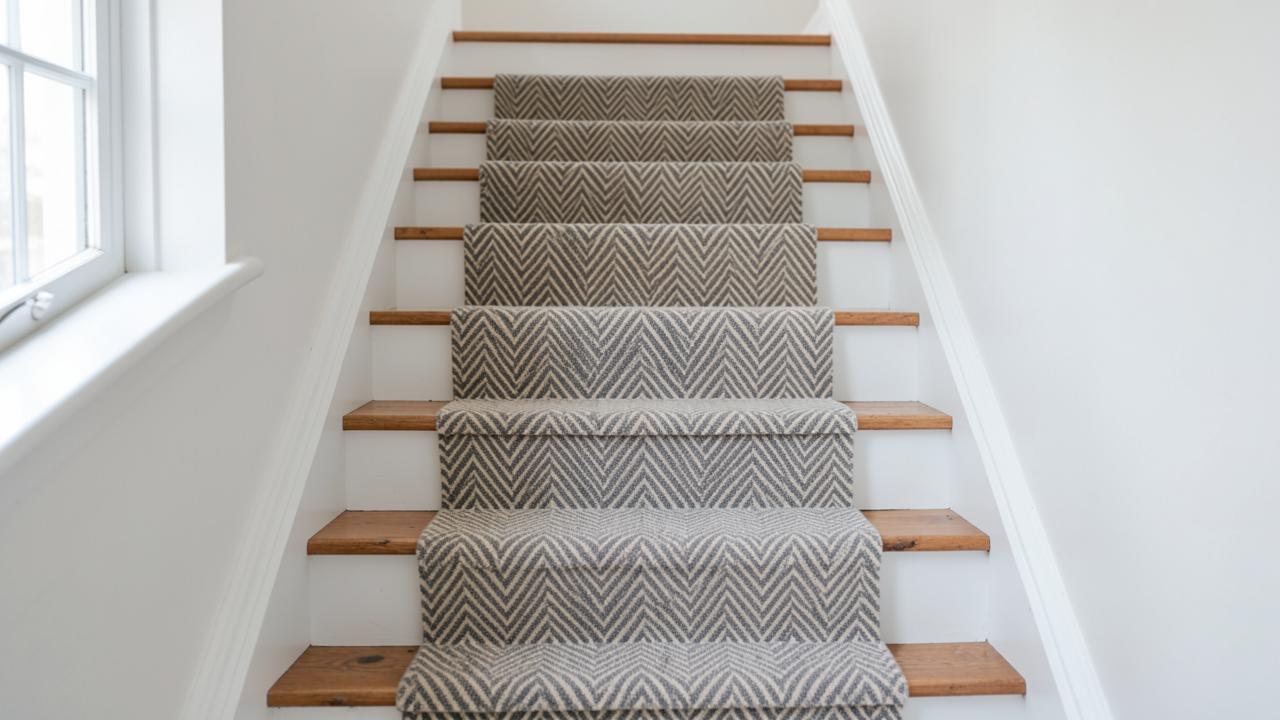 DesignStair Runner Patterns ExplainedHerringbone, chevron, stripes, plaid, geometrics and animal prints judged by how they behave on a staircase.
- DesignChoosing a Stair Runner ColourHow light, adjacent flooring, trim colour, traffic and dirt should drive the colour decision.
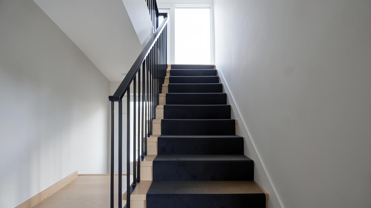 DesignModern Stair Runner IdeasContemporary, traditional, farmhouse and vintage directions, and what makes each read as deliberate.