Design
Modern stair runner ideas
Style labels are only useful if they translate into decisions. Here is what each of the common directions actually asks of your runner width, colour, pattern and edge.
Written by the StairRunner.co editorial team · Updated 4 September 2026
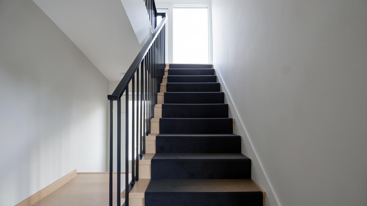
Four directions, and what each requires
| Direction | Field | Edge and hardware | Watch for |
|---|---|---|---|
| Contemporary minimal | Solid or tonal texture, low contrast | Narrow matched binding; no rods | Solids show footprints and shading more |
| Classic / period | Stripes or a small traditional repeat | Serged edge; brass or antique rods | Rods add fitting time and cleaning effort |
| Farmhouse | Natural fibre or a wool loop, muted tones | Cotton binding, often contrasting | Plant fibres and moisture do not mix |
| Vintage / rug-look | Faded, multi-tonal, worn-in patterning | Bound edge, sometimes fringe-free rug runner | Pattern must survive being cut at each nosing |
Decisions that make more difference than style
- Width and margin. Even margins on both sides, checked at several steps — see runner width.
- Pattern scale relative to tread depth. A repeat that resolves within one step reads calm. See patterns explained.
- Contrast with the exposed tread. Enough to define the runner, not so much that every wobble in the margin is visible.
- Edge finish. Binding announces itself; serging recedes. Both are choices — see custom runners.
- Fitting method. A Hollywood fit gives crisp, tailored lines; a waterfall gives a softer, looser one.
What "modern" actually changed about runner design
The traditional stair runner — a striped or floral wool strip, brass rods, a generous exposed tread margin either side — developed for houses with painted or stained timber treads that were worth showing off. Contemporary schemes often start from a different premise: the treads may be plain engineered timber, the balustrade may be glass or steel, and the goal is a calm, unified line rather than a decorative accent. That shift explains most of what reads as "modern" in a runner: narrower margins, quieter colour, and an edge finish that disappears rather than announces itself.
None of this makes the traditional approach wrong. A Victorian or Edwardian staircase with turned balusters and a stained timber margin generally looks better served by a runner that acknowledges that heritage than by one that fights it. Style should follow the staircase's existing architecture, not a trend independent of it.
Fibre choices that suit a modern look
Wool remains the most common fibre for a contemporary runner because it takes dye well, holds a crisp tonal colour, and resists crushing under repeated foot traffic. Wool-blend constructions add synthetic fibre for stain resistance without losing much of that look. Pure synthetic runners have improved a great deal and now include some genuinely convincing wool-alike ranges, which matter where spill resistance or budget rule wool out. The trade-offs between these are covered fully in wool versus synthetic, and the wider fibre and construction landscape is in stair runner materials.
Sisal, seagrass and other plant fibres appear often in farmhouse and coastal-influenced schemes because of their natural colour and visible weave texture. They are less forgiving of moisture and spills than wool, which matters on a staircase near an entrance. The specifics are set out in sisal stair runners.
Getting the minimal look right without it looking unfinished
A very plain runner risks reading as unfinished rather than deliberate if the surrounding details are not equally considered. A few things separate a genuinely calm, minimal staircase from one that simply looks under-designed:
- Precision of the cut and fit. With nothing else to look at, any waviness in the runner's edge or inconsistency in the margin becomes the focal point. A Hollywood fit with tight, tailored corners at each nosing suits this look far better than a loose waterfall fit.
- A single, confident colour decision. Rather than a "safe" beige chosen by elimination, pick a tone that is clearly intended — a specific warm grey, a deep charcoal, a muted sage — and commit to it across the full run.
- Consistent hardware, or none. Exposed stair rods read as a traditional device. If you want a minimal look, either omit them and rely on adhesive or gripper fixing, or choose a slim, matt rod that does not draw attention. Mixing finishes across a flight looks accidental. See stair rods for the fixing options.
- Underlay that supports a crisp line. A thin, dense underlay keeps the runner sitting flat and tight at the nosing, which matters more visually in a minimal scheme than in a busier one. Detail is in choosing an underlay.
How the four directions age
Every style label eventually looks dated to some eye, but some ageing paths are easier to live with than others. Contemporary minimal schemes tend to age by feeling slightly featureless rather than actively wrong, and are the easiest to refresh by changing wall colour or hardware alone. Bold pattern-led schemes age more visibly because the pattern itself carries a strong period signature, but they also tend to be replaced by choice rather than necessity, since the fibre underneath often still has useful life left. Natural fibre and farmhouse schemes age gracefully because wear and slight fading read as character rather than damage, provided the fibre was suited to the traffic it received in the first place.
Colour, light and the passage of time
Staircases are usually the least evenly lit part of a house, and a runner is looked at from both below and above. Mid-tones with some tonal variation hide traffic and shading better than either very pale or very dark solids, which is the practical reason so many long-lasting schemes land there. The full reasoning is in choosing a runner colour, and the durability side of the same decision is in best carpet for a stair runner.
Reading a scheme before you commit to a direction
Before choosing a style label, look honestly at three fixed things: the tone and grain of the exposed tread, the amount of daylight the stairwell receives, and the busiest sightline — usually the view from the front door or the landing above. A direction that ignores any of these will fight the house rather than sit in it, however good it looks in a photograph. A dark, low-light stairwell rarely suits a heavy, dark contemporary scheme; a bright, double-height stairwell can carry pattern and contrast that would overwhelm a narrow, enclosed one.
How proportion changes with staircase width
| Staircase width | Effect of a narrow runner | Effect of a wide runner |
|---|---|---|
| Narrow (cottage-width) | Emphasises the margin timber; can look mean if margins are uneven | Leaves little margin at all; risks feeling like wall-to-wall carpet |
| Standard domestic | Reads crisp and tailored, especially with a Hollywood fit | Reads generous and traditional, especially with stair rods |
| Wide or grand | Can look lost against a large stairwell unless the pattern scale compensates | Suits pattern and a more decorative, formal treatment |
Lighting a staircase to support the design
A runner's colour and texture are only as good as the light that falls on them. Staircases are frequently under-lit relative to the rooms they connect, which flattens tonal variation and mutes pattern. A low-contrast, minimal scheme in particular depends on even, reasonably bright light to avoid looking dull rather than deliberate. Where possible, view any sample under the stairwell's actual lighting — including at the time of day or evening when the stairs are used most — before finalising a colour discussed in choosing a runner colour.
Mixing periods without it looking accidental
Many houses are not purely one style — a Victorian staircase in an otherwise modernised home, or a plain modern staircase in a period shell. The runner does not have to resolve this tension by picking a side. A traditional striped runner with a very restrained, modern edge treatment, or a plain contemporary field finished with a period-appropriate brass rod, both read as intentional bridges between eras rather than confusion, provided the rest of the detailing — hardware, colour, fitting precision — is consistent with whichever side of the mix is doing the most visual work.
A short checklist before ordering a "modern" runner
- Margins measured and confirmed equal at several points along the flight, not just the top step.
- Pattern repeat, if any, checked against actual tread depth rather than assumed.
- Edge finish and hardware chosen together, not decided separately at different stages.
- Sample viewed on the actual stairs, under the actual lighting, at more than one time of day.
- Fibre and construction checked for durability, not chosen on looks alone — see best carpet for a stair runner.
When to bring in a designer versus deciding alone
Most of these decisions are within reach of a confident homeowner working carefully through samples and measurements. A designer earns their fee where the staircase sits at the centre of a wider scheme — an open-plan hall visible from several rooms, a feature balustrade, or a house where several flooring transitions need to agree with each other at once. In those cases the runner is one variable among several, and getting an outside eye on the whole junction of materials is often worth more than getting the runner exactly right in isolation.
Frequently asked questions
- What makes a stair runner look modern?
- Usually three things together: a narrower runner with generous, even side margins; a low-contrast or single-colour field; and a crisp, minimal edge finish. Modern reads as restraint and precision far more than as any particular pattern.
- Are patterned runners still current?
- Yes, but scale is what dates a runner rather than the pattern itself. A small, tight repeat sized to the runner width looks considered in almost any scheme; an oversized motif chopped by the nosing on every step looks accidental.
- Should the runner match the upstairs carpet?
- It does not need to match, but it should relate. Continuing the same fibre and tone family reads as one decision; a completely unrelated runner reads as two. If they differ, make the difference clearly intentional rather than nearly the same.
- What is the most common mistake in a modern scheme?
- Uneven margins. A runner that is a centimetre off centre undoes an otherwise perfect scheme, because a staircase presents both margins to the eye at once from below.
- Can a modern runner still use pattern?
- Yes. A small, tight, low-contrast pattern reads as texture from a normal viewing distance and still counts as modern. It is scale and contrast that signal restraint, not the total absence of pattern.
- Is wall-to-wall stair carpet ever the more modern choice?
- Sometimes, particularly where the treads themselves are not attractive enough to expose. A runner over exposed timber generally reads as more considered because it shows two deliberately chosen materials rather than one.
- How do I keep a minimal scheme from looking cold?
- Add texture rather than colour. A tonal wool with visible fibre depth, or a subtle herringbone weave, keeps a low-contrast scheme from feeling flat or clinical.
Related guides
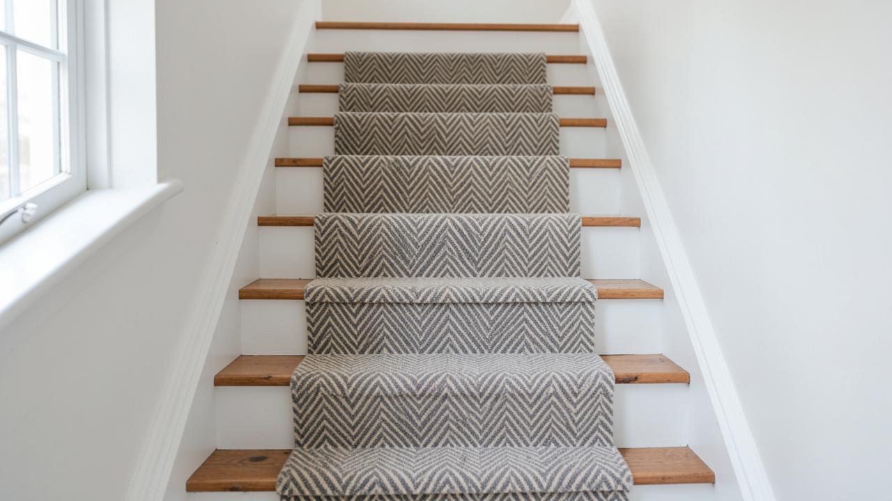 DesignStair Runner Ideas That Actually WorkPattern scale, stripe direction, colour and border choices explained in terms of your staircase, not a mood board.
- DesignStair Runner Patterns ExplainedHerringbone, chevron, stripes, plaid, geometrics and animal prints judged by how they behave on a staircase.
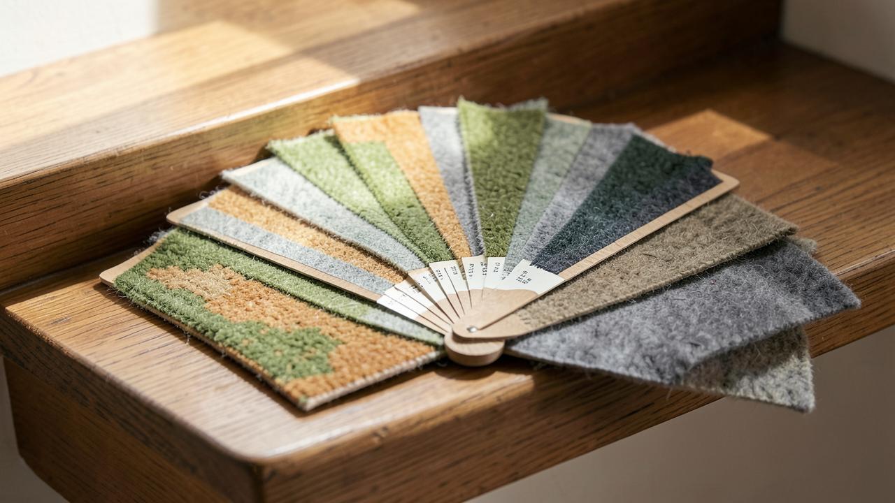 DesignChoosing a Stair Runner ColourHow light, adjacent flooring, trim colour, traffic and dirt should drive the colour decision.
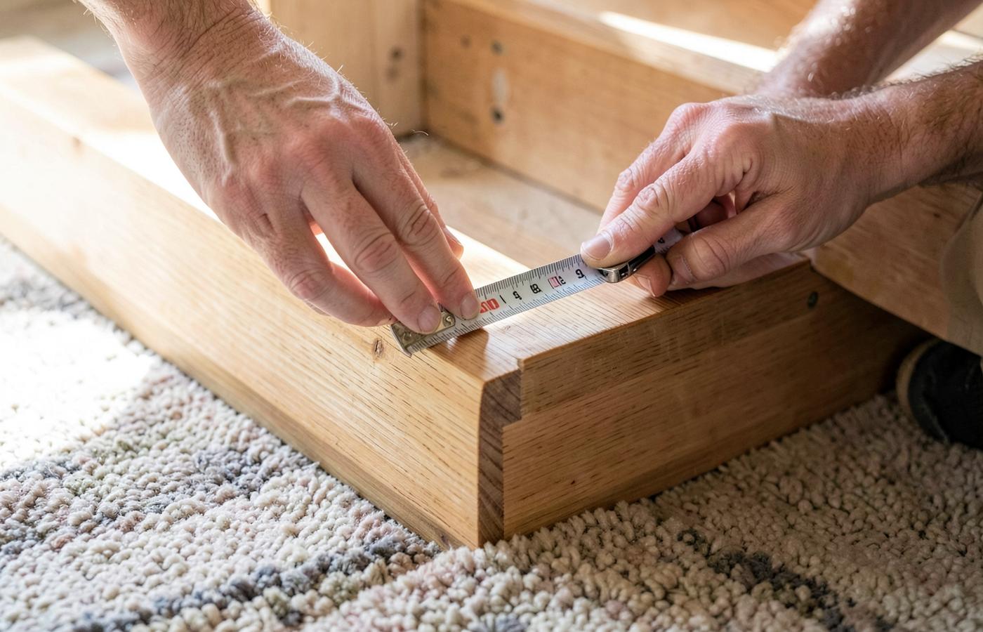 MeasurementWhat Width Should a Stair Runner Be?How to set runner width and side margins from your stair width, stringers, balusters and pattern.