Design
Choosing a stair runner colour
Colour on a staircase is judged in motion, in awkward light, and against fixed elements you are not going to change. That makes it a different problem from choosing a rug.
Written by the StairRunner.co editorial team · Updated 4 September 2026
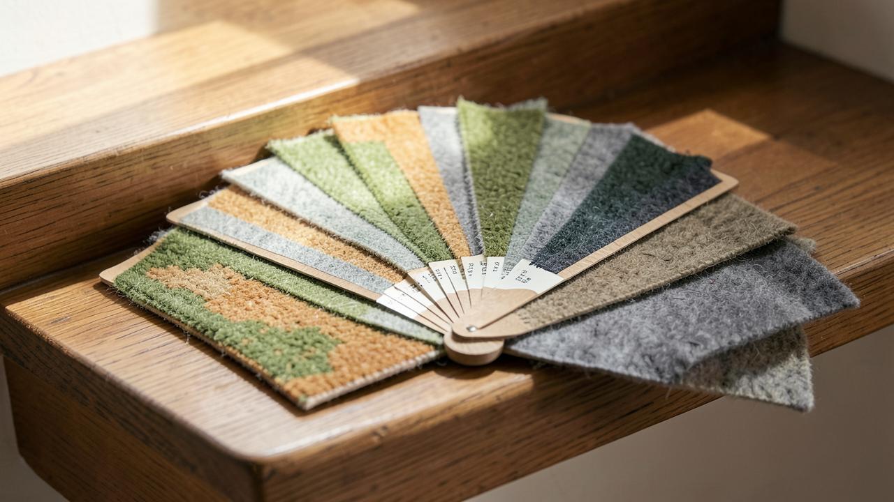
Work from the fixed elements
- Tread and riser finish. A warm oak margin fights a cool grey runner. Warm timber wants warm neutrals, greens and reds; painted white risers are neutral and free you up.
- The hall floor the runner lands on. The junction at the bottom step is the most-seen colour relationship in the house.
- Trim, skirting and balustrade colour. These frame the runner on both sides for its whole length.
- Light. A north-facing or windowless stairwell drains warmth; colours read greyer and darker there than in the shop.
How the colour families behave
| Colour | What it does to the stairs | Practical trade-off |
|---|---|---|
| Cream / pale neutral | Opens up a dark stairwell; quiet and architectural | Shows soil fastest; needs frequent vacuuming |
| Beige / greige | Recedes; lets the staircase and hall lead | Can look flat unless the yarn is multi-tonal |
| Mid grey | Contemporary and neutral against painted trim | Reads cold beside warm timber; pick a warm grey |
| Brown / tobacco | Warm, traditional, hides soil very well | Can deaden a dark stairwell further |
| Green | Works unusually well with both oak and painted white | Muted olive and sage age better than saturated green |
| Blue / navy | Crisp against white risers; strong vertical line | Dark navies show dust and lint clearly |
| Red / burgundy | Classic in period halls; very good at hiding marks | Dominates; hard to change the scheme around later |
| Black / charcoal | Graphic and modern; frames pale treads | Every fleck of dust shows; needs a matte, flecked yarn |
Contrast, safety and visibility
Being able to see where each step ends matters, particularly for older occupants and anyone with reduced vision. A runner with meaningful tonal contrast against the tread margin, or a scheme where the nosing line stays visible, helps. Avoid busy high-contrast patterns that visually break up the step edges — that is the pattern of colour that causes hesitation on a flight. Related guidance is in stair runner safety.
Understanding undertone before you compare swatches
Undertone is the subtle colour bias within what looks, at a glance, like a single neutral. A "grey" carpet might lean warm, closer to taupe, or cool, closer to blue-grey. A "cream" might lean yellow or lean pink. Two neutrals that look identical held separately can clash once placed side by side, which is exactly what happens when a runner meets a hall floor or a painted skirting.
The quickest way to check undertone is to place the candidate sample against a genuinely neutral white card, in the same light where it will actually live. Whatever colour cast appears against the white is the undertone you are working with. Do the same for the hall floor, the trim paint and the tread finish, and you will quickly see whether they share a family or are pulling in different directions.
A practical method for choosing colour
- List the fixed elements you cannot change — tread and riser finish, hall floor, balustrade, skirting and trim colour, and the stairwell's daylight level.
- Identify the undertones of each, using the white-card method above.
- Decide whether you want harmony or contrast. Harmony means picking a runner colour that shares an undertone with the fixed elements. Contrast means choosing a colour that is deliberately distinct, which needs more confidence but can look sharper.
- Shortlist by fibre and durability requirement before falling for a specific shade, using stair runner materials or, for a fast comparison of the two most common camps, wool versus synthetic.
- Test the shortlist on the actual stairs, not on a table or against a paint chart, in both daylight and artificial light.
Colour and the visual length of a staircase
Colour affects perceived proportion as much as pattern does. A runner in a colour close to the wall colour tends to make the stairwell feel more continuous and spacious, because there is less visual interruption between surfaces. A runner in strong contrast to the walls draws a clear line down the flight and can make a short staircase feel more deliberate, at the cost of making the space feel busier. Neither is objectively correct; the choice depends on whether the staircase should recede into the house or announce itself as a feature.
How colour interacts with fibre sheen
The same dye colour can look completely different depending on how much the fibre reflects light. A shiny, tightly twisted synthetic yarn will show a colour as more saturated and can produce a watermarking effect, where the pile looks a different shade depending on the direction you view it from and the direction it was walked on. A matte wool or wool-blend yarn diffuses light more evenly and holds a truer, more consistent colour across the whole flight. If colour consistency matters more to you than sheen, factor this into the fibre decision as well as the shade itself.
Borders as a colour tool
A bound edge in a second colour lets you use a calm field and still get definition down the flight. It is the cheapest way to make a plain runner look specified, and it gives you a colour to echo elsewhere in the hall. Pattern interactions are covered in stair runner patterns.
Colour myths worth retiring
- "Neutral means safe forever." Neutrals date too, just more slowly. A flat, cool beige with no texture reads as a decorating decision from a specific decade almost as clearly as a bold colour does.
- "Dark colours always hide dirt best." Dark solids hide liquid stains reasonably well but show dust, lint and pet hair more than a mid-tone, multi-flecked colour of similar depth.
- "The runner should match the walls." A close but imperfect match usually looks like an error rather than a coordinated scheme. Either commit to a genuine match in the same paint or dye family, or choose something clearly distinct.
- "Colour is purely a matter of taste." Taste decides between suitable options; it does not override the practical constraints of light, fixed finishes and traffic that decide which options are actually suitable in the first place.
How to shortlist colours systematically
- Photograph the stairwell in daylight and again under evening lighting, including the treads, risers, skirting and any visible wall colour in the same frame.
- Gather three to five candidate samples, spanning at least two undertone families rather than five shades of the same neutral.
- View each sample against the photographs and, ideally, physically on a step, at the times of day the stairs get the most and least light.
- Eliminate any sample that looks noticeably different from how it appeared in the shop or online — that shift is information about your specific stairwell, not a flaw in the carpet.
- Cross-check the remaining shortlist against fibre and durability needs before making a final choice, using stair runner materials.
Colour choices for specific staircase conditions
| Condition | Colour tendency that usually helps |
|---|---|
| North-facing or windowless stairwell | Warmer neutrals; avoid cool greys and blues, which read colder still |
| Very sunny stairwell with direct light | Solution-dyed or fade-resistant colour, since prolonged direct sun fades most fibres |
| Open to a small, dark hallway | A colour a shade or two lighter than the darkest fixed surface, to avoid compounding the gloom |
| Households with pale flooring throughout | A runner with enough depth to read as a distinct, deliberate element rather than disappearing |
| High-traffic family stairs | Mid-tone, multi-fleck colourways that forgive everyday soiling between cleans |
Colour when replacing an existing runner
Where a runner is being replaced rather than fitted for the first time, the old carpet leaves a faint but real record of what worked and what did not — a worn band that shows exactly where the traffic falls, and a truer sense of how quickly the previous colour aged in your particular light. Use that evidence rather than starting the colour decision from nothing, especially if the previous choice disappointed you: work out specifically why it did, whether that was the tone, the lack of tonal variation, or simply the fibre wearing out, before assuming the colour itself was the problem.
Frequently asked questions
- What colour stair runner hides dirt best?
- Mid-tone, multi-tonal colours — heathered greys, greige, soft browns, muted greens — hide soil best. Very pale colours show every mark and very dark ones show dust, lint and pet hair. A flecked or two-tone yarn hides more than a flat solid of the same depth.
- Should the runner match the hallway floor?
- It should relate to it, not match it. An exact match rarely lands because the materials reflect light differently, and the near-miss reads as a mistake. Either go clearly tonal — a shade or two apart in the same family — or go deliberately contrasting.
- Do dark runners make a stairwell feel smaller?
- A dark runner narrows the visual line of the flight, which can make a tight stairwell feel more enclosed — but it also anchors the stairs and hides wear. In a dark stairwell, the bigger problem is usually the wall colour and lighting, not the runner.
- Is a beige or neutral runner a safe default?
- It is a common one, and it works when the neutral has some warmth or texture in it. A flat, cool beige with no tonal variation tends to look grubby quickly on stairs because all the traffic falls in one band.
- Should I choose colour before or after fibre?
- Choose fibre and construction requirements first, because they narrow the practical range considerably, then choose colour from within that shortlist. Choosing colour first often leads to falling for a shade that only exists in an unsuitable fibre for your household.
- How much does artificial light change a runner colour?
- Considerably. Warm tungsten-style bulbs push blues toward grey and intensify warm tones; cool LED light does the opposite. Since stairwells are frequently seen under artificial light in the evening, testing the sample under your actual bulbs matters as much as testing it in daylight.
- Do different rooms at the top and bottom of the stairs affect the colour choice?
- Yes. A runner is often visible from two different rooms with two different colour schemes at once. Where the schemes clash, a genuinely neutral runner acts as a buffer; where they are compatible, the runner has more freedom to pick up either palette.
Related guides
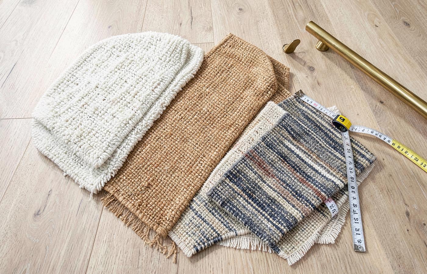 MaterialsStair Runner Materials ComparedWool, nylon, polypropylene, sisal and jute judged on stair-specific wear, comfort, cleaning and safety.
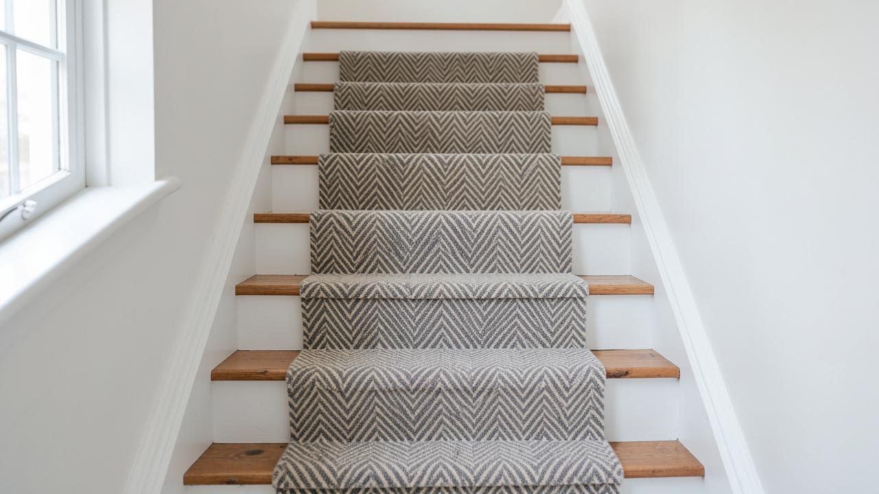 DesignStair Runner Ideas That Actually WorkPattern scale, stripe direction, colour and border choices explained in terms of your staircase, not a mood board.
- DesignStair Runner Patterns ExplainedHerringbone, chevron, stripes, plaid, geometrics and animal prints judged by how they behave on a staircase.
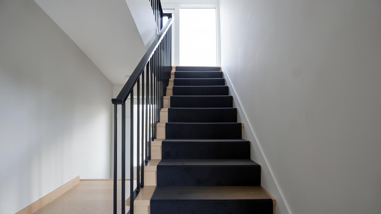 DesignModern Stair Runner IdeasContemporary, traditional, farmhouse and vintage directions, and what makes each read as deliberate.