Design
Stair runner ideas that actually work
Not a gallery. The reasoning behind pattern scale, stripe direction, borders and colour, so you can judge a sample against your own staircase.
Written by the StairRunner.co editorial team · Updated 4 September 2026
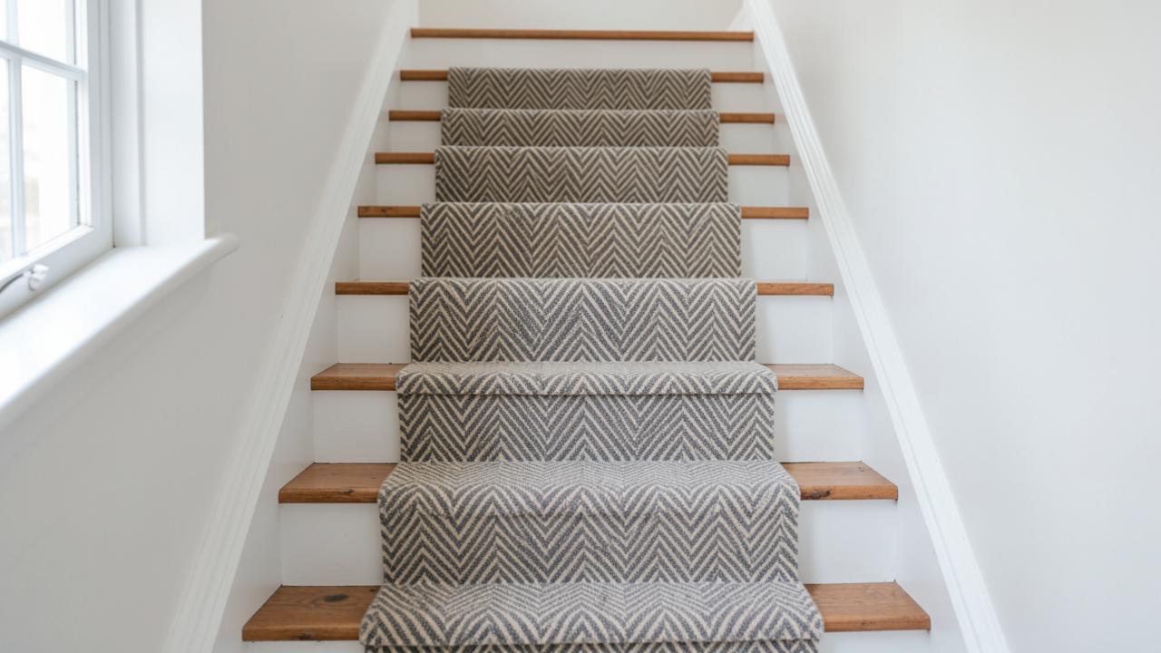
Start with how the staircase is seen
A staircase is viewed from below, foreshortened, so risers dominate and treads almost disappear. That single fact explains most successful runner choices. A pattern with a large repeat loses its logic when only a band of it is visible per riser. A pattern with a repeat of a few inches reads as texture and holds up from any angle.
- Narrow stairs (under 32 in / 81 cm) — small-scale geometrics, herringbone, fine stripes and textured solids. A large floral or medallion gets cropped at the edges.
- Standard stairs (32–40 in / 81–102 cm) — most patterns work; scale becomes a taste decision rather than a constraint.
- Wide or feature staircases — a bordered runner or a bold repeat has room to be read properly.
Pattern families and what they do
| Pattern | Effect | Practical note |
|---|---|---|
| Vertical stripes | Lengthens the flight, emphasises the climb, feels crisp and current | Any drift in alignment is immediately visible — needs an accurate fit |
| Horizontal bands | Marks out each step, reads traditional and grounded | Bands must land identically on every tread; adds material and labour |
| Herringbone / chevron | Texture and movement without a strong motif; forgiving on soil | Directional — the whole run should come from one roll |
| Animal and leopard prints | Statement piece; the multi-tonal ground hides wear unusually well | Commits the hallway to a stronger scheme than most people expect |
| Plaid and tartan | Warm, traditional, strong period-property fit | Two-directional matching; the most demanding pattern to fit well |
| Textured solids | Lets architecture and joinery lead | Shows soil and traffic lanes faster than any pattern |
Colour, light and the margins
The visible tread margin on each side is part of the composition, not leftover space. A warm oak margin pushes a cool grey runner toward looking flat; the same runner against painted white treads looks deliberate. Before committing:
- Lay the sample on a tread and look at it from the bottom of the flight.
- Check it in the evening under artificial light — most stairwells are poorly lit.
- Hold it against the wall colour, the trim and the hall flooring at the same time.
- Consider the undertone of your timber. Yellow-toned pine and cool-toned engineered oak need different neutrals.
How stairwell architecture changes the shortlist
Not every idea that looks good in a catalogue survives contact with a real staircase. Open-sided flights, winders, curved treads and very narrow half-turns each rule certain patterns out before you get to colour or fibre at all. It is worth doing this filtering first, because it saves you sampling ideas that were never going to work on your particular geometry.
- Open-sided (cut-string) stairs. One edge of the runner is visible in profile as well as from above, so a strong border or contrast binding earns its keep — it defines an edge that would otherwise look unfinished. A busy allover pattern can look chaotic when you see both its face and its cut edge at once.
- Winders and curved flights. Directional patterns — stripes, chevron, herringbone — have to bend or twist through the turn, and a rigid geometric will crack or distort visually at that point. Textured solids and small irregular patterns cope far better, which is why plain and near-plain runners dominate on curved staircases. See fitting a runner over winders for how the geometry itself is handled.
- Narrow flights. Anything with a large motif gets cropped by the runner width before it can complete a repeat, which reads as a mistake rather than a design choice. Keep the pattern scale proportionate to the width you have actually decided on, using the reasoning in runner width.
- Very long, uninterrupted flights. A long straight run is the one place where a large-scale pattern or a bold colour genuinely has room to be read properly, because you see multiple repeats before the eye moves on.
Ideas by room and household, not just by taste
A runner idea that suits a household with young children, pets, or frequent guests is not always the one that photographs best. Matching the idea to how the stairs are actually used prevents a good-looking choice turning into a source of ongoing frustration.
| Circumstance | Idea that tends to work | Idea to be cautious with |
|---|---|---|
| Young children, muddy shoes | Mid-tone multi-fleck pattern, durable fibre, bound edge | Pale solid, delicate natural fibre with no protective finish |
| Dogs or cats using the stairs daily | Low-loop or tight weave, patterned or heathered | Long shaggy pile that traps hair and claws snag on |
| Rental property, tenant turnover | Neutral mid-tone, hard-wearing, easy to source again | A strong bespoke colourway that limits future tenants' taste |
| Period house, original joinery | Traditional stripe, small repeat, brass stair rods | A hard contemporary geometric that fights the mouldings |
| Households with older or visually impaired occupants | Runner with clear tonal contrast against the tread margin | Busy high-contrast pattern that visually breaks up each step edge |
Terminology worth knowing before you shop
A few terms recur across every supplier's site and it helps to know what they actually mean before you start comparing options.
- Repeat. The distance before a pattern begins again. A small repeat sits comfortably within one tread; a large one may only show a fragment per step.
- Colourway. A specific colour version of a given pattern. Most patterned runners come in several, so a pattern you like in the wrong colour is often still available in the right one.
- Ground colour. The dominant background colour a pattern sits on, as distinct from the accent colours within the motif.
- Runner width. The finished width of the strip, excluding any exposed tread margin either side — see how width is chosen.
- Waste allowance. Extra length or width bought to allow for pattern matching and fitting; larger for two-directional patterns.
Common myths about runner design
A few ideas persist that do not hold up once you look at how a runner is actually seen and used.
- "Dark hides everything." Dark hides stains but shows dust, lint and pet hair more than a mid-tone multi-fleck colour does.
- "Pattern is only for period houses." Small-scale geometric and textured patterns sit comfortably in contemporary schemes; it is the scale and colour palette that signal the era, not the presence of pattern itself.
- "A wider runner always looks more generous." Beyond a certain point a wide runner on a narrow flight leaves an uncomfortably thin margin of exposed tread, which reads as cramped rather than generous.
- "Any carpet can become a runner." Fibre and construction matter as much as the surface look — a carpet built for a low-traffic bedroom will wear quickly on stairs regardless of how good the pattern looks.
Borders and edge finishes
A contrasting binding sharpens the line of the runner and defines its edges against the tread. A matching binding lets the pattern read as a continuous field. Wide fabric borders in linen or cotton look elegant but sit at the edge of a walking surface, so on a busy family staircase a durable serged or narrow bound edge is the more realistic choice.
Coordinating with the hallway
Most staircases land directly into a hallway, so the runner is seen alongside that floor constantly. Two approaches work reliably: carry a shared undertone through both surfaces, or make the runner clearly distinct so the eye reads two intentional materials rather than a mismatch. Where the runner continues onto a landing, keep pattern and pile direction continuous — a change of direction across a landing is one of the most noticeable fitting faults, and it needs planning at the measuring stage.
Practicality is a design decision
The most beautiful runner in the wrong fibre becomes the shabbiest surface in the house within two years. Match the look you want to a fibre and construction that survives your traffic, and check how your chosen material responds to cleaning before you order it.
Frequently asked questions
- Do stripes make a staircase look longer?
- Runners with stripes running up the flight emphasise its length and its verticality. Horizontal banding across each tread breaks the run into steps and reads as more traditional. Choose according to whether the staircase is a feature or a link between rooms.
- Should the runner match the hallway flooring?
- It should relate rather than match. Matching a runner exactly to a hall carpet usually looks like a failed attempt at continuity. Picking up an undertone from the hall floor is more reliable.
- Are patterned runners harder to keep clean?
- Pattern hides soil and traffic lanes more effectively than a flat mid-tone. The practical downside is fitting cost, because pattern matching consumes extra material and labour.
- What colour hides wear best on stairs?
- Mid-tone, multi-tonal or patterned colours. Very dark solids show lint and dust; very pale solids show soil at the nosing, which is exactly where eyes land as you climb.
- How many runner ideas should I sample before deciding?
- Three to five is usually enough. More than that and the differences blur together and the decision gets harder, not easier. Narrow the field on paper first using scale and colour logic, then sample only the genuine contenders.
- Do runner ideas from a rug work on a staircase?
- Some do, if the rug is available in a runner width or can be cut and bound to one. The main risk is pattern scale: motifs designed to sit flat on a floor rug are often too large to resolve sensibly across a single tread.
- What is the single most common regret with runner choice?
- Choosing on a small swatch rather than a large sample laid on the actual stairs. A swatch the size of a hand cannot show you how a pattern repeats, how a colour reads under stairwell light, or how the fold at the nosing behaves.
- Can I mix two different patterns on one staircase?
- It is possible but risky. The safest way to mix is to use a patterned runner on the straight flights and a coordinating solid colour on the landings. This defines the different zones without visual clutter.
- Should the runner width match the width of the front door?
- There is no requirement for them to match, but aligning the runner with the centre of the door can create a pleasing sense of symmetry as you enter the house.
Related guides
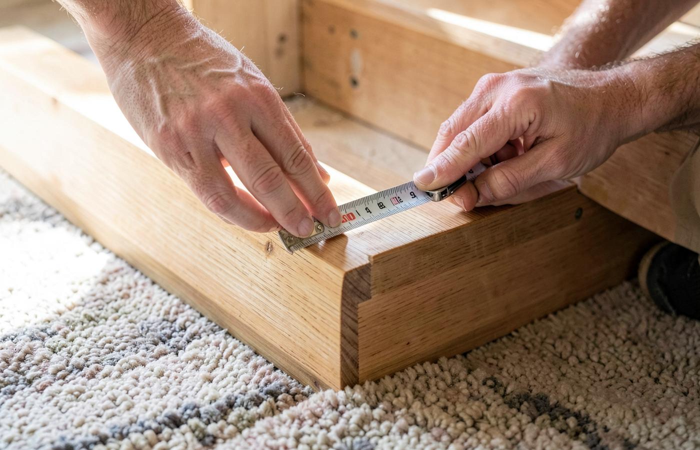 MeasurementHow to Measure for a Stair RunnerThe tread-plus-riser formula, waste allowance, winders and landings, plus a calculator that shows its working.
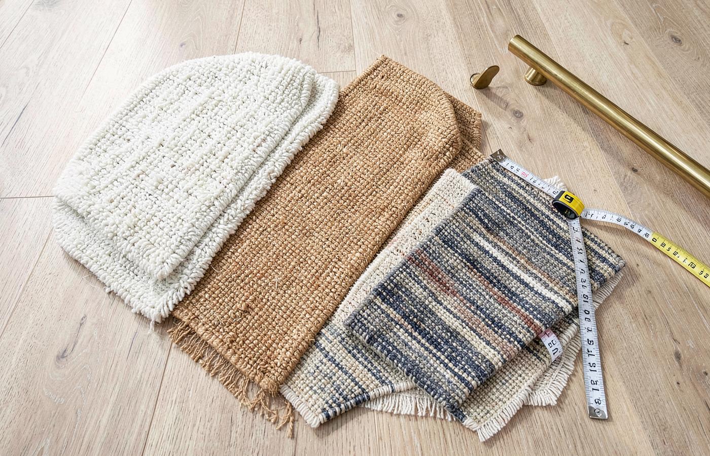 MaterialsStair Runner Materials ComparedWool, nylon, polypropylene, sisal and jute judged on stair-specific wear, comfort, cleaning and safety.
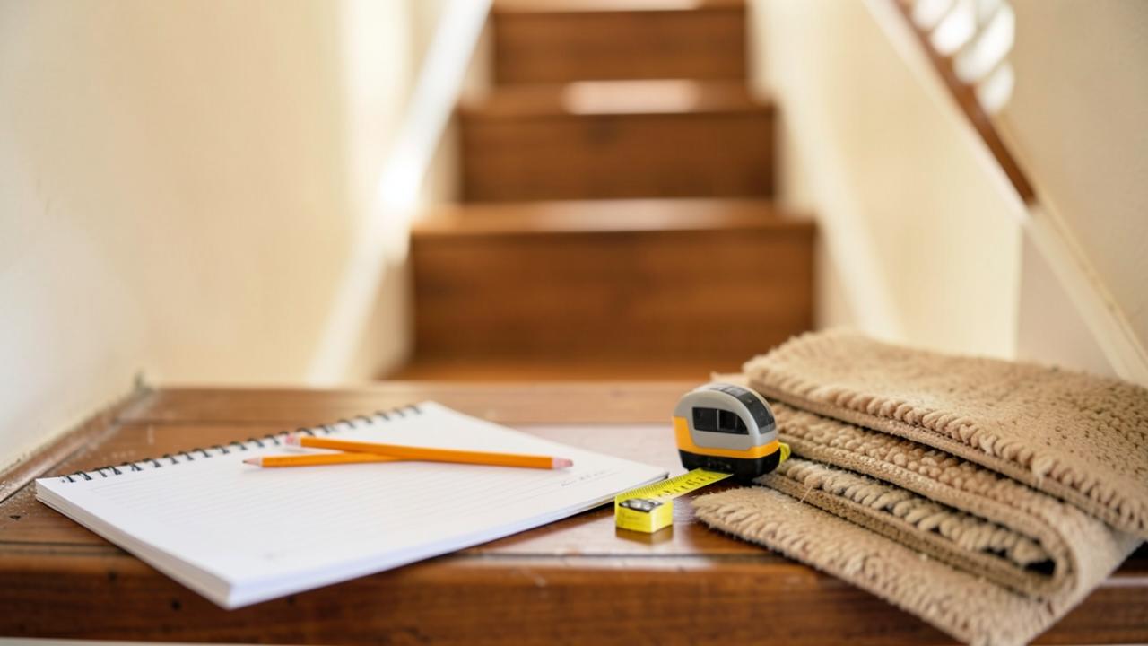 CostWhat Affects Stair Runner CostThe material, labour and complexity variables behind a runner quote, and how to compare estimates fairly.
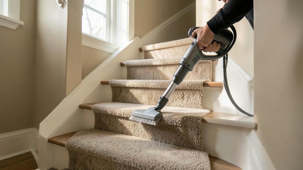 CareCleaning and Caring for a Stair RunnerRoutine vacuuming, spill response by fibre type, slipping and fraying, and when to call a professional.
Texture and light: the "shading" effect
The direction of the pile (the "nap") has a profound effect on how a runner looks. If you look "into" the pile, the colour appears deeper and richer; if you look "down" the pile, it reflects more light and looks paler. Because stairs involve looking at the carpet from multiple angles — from the bottom looking up, and from the top looking down — a plain runner can appear to be two different colours at the same time. This is particularly noticeable in velvets and dense saxony piles. When choosing a colour, always hold the sample vertically against a riser as well as flat on a tread to see how these light shifts will play out across the flight.
The psychology of the landing transition
Where the runner meets a landing, you have a choice: stop it cleanly at the top step, or continue it across the landing to the next flight or the hallway. Continuing the runner creates a "pathway" that guides the eye and the foot, making the house feel more connected. However, it also creates more "edges" where the carpet meets the landing floor. A common design mistake is to change the width of the runner as it moves onto a landing; for the best visual flow, keep the width and the margin size consistent throughout the entire journey. Read more on landings andwidth choices.
Coordinating with adjacent flooring
A runner rarely exists in isolation. It usually begins where a hallway floor ends. To create a professional look, pick out a secondary colour from your hallway tiles or the grain of your timber floor and use that as the primary tone for your runner. If you have asisal or natural fibre in the hall, continuing a similar texture onto the stairs is a safe bet. For more adventurous schemes, see our color guide ormodern ideas.