Style
Colourful stair runners: choosing and living with bold colour
A staircase is one of the few places in a house where a strong colour can be used with real confidence, because it is seen in passing rather than lived alongside all day. Here is how to choose one that still looks right in five years.
Written by the StairRunner.co editorial team · Updated 4 September 2026
Why the staircase is a good place for colour
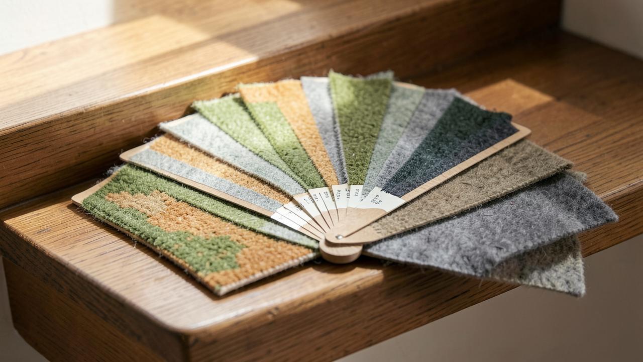
Most rooms are lived in for hours at a time, which makes a strong colour choice a genuine commitment: you see it over breakfast, in the evening, in every mood. A staircase is different. It is a transitional space, walked through rather than sat in, glimpsed from the hallway and from upstairs landings rather than stared at directly. That makes it one of the few areas of the house where a colour that would feel overwhelming on a sofa or a wall reads instead as a welcome flash of interest. A runner running the full flight also has a natural frame — the treads, risers and skirting either side — so the colour is contained rather than spreading across an entire room.
Choosing colour before choosing pattern
It is tempting to shop by pattern first, because patterned runners are often displayed as a single finished look. A more reliable approach is to choose the colour family first, then look for a construction and pattern within that family. A colour decision anchors everything else: the tone of the walls, the woodwork, the front door, and any art or textiles nearby. A pattern decision made first tends to lock you into whatever colours that particular design happens to include, some of which may not suit your hallway at all.
| Colour family | Typical mood | Works well with |
|---|---|---|
| Deep red or burgundy | Traditional, warm, formal | Dark timber, brass stair rods, period hallways |
| Teal or deep green | Rich, grounded, contemporary or traditional | White or pale walls, brass or black fittings |
| Mustard or ochre | Warm, characterful, slightly retro | Charcoal or navy woodwork, natural timber |
| Cobalt or navy | Confident, cool, classic | White walls, natural light, coastal or Georgian hallways |
| Multi-colour stripe | Informal, playful, eclectic | Plain painted walls, minimal other pattern in the space |
Reading a sample honestly
Colour on a screen and colour under a supplier's showroom lighting both mislead. Order a genuine physical sample, as large as the supplier will provide, and look at it in the actual stairwell at different times of day. North-facing stairwells receive cool, flat light that can make warm colours look muted and cool colours look colder still; stairwells with a skylight or south-facing window swing more dramatically between bright daylight and evening artificial light. Lay the sample directly on the treads rather than propping it against a wall, since the colour of the timber or existing floor beneath changes how the runner colour reads.
Fibre choice for strong, lasting colour
Any colour, however carefully chosen, is only as good as the fibre carrying it. Two things matter here: how deeply the colour is held in the fibre, and how well that fibre resists the fading and abrasion a staircase produces. Wool takes dye into the fibre during processing and is prized for the depth and warmth it gives strong colours, particularly reds, greens and blues; it is also naturally resilient underfoot. Solution-dyed synthetics, most commonly nylon, have colour built into the fibre itself before it is even spun, which makes them highly resistant to fading from light and from the cleaning products a busy household uses. Surface-dyed synthetics sit between the two and are the most likely to show colour loss first in the traffic lane. For more on how fibre choice affects performance generally, see choosing the best carpet for a stair runner.
Where bold colour goes wrong
- Choosing colour and pattern from a single small swatch. A pattern that looks balanced in a ten-centimetre sample can read very differently repeated down a fifteen-step flight.
- Ignoring the walls either side. A bold runner against equally bold wallpaper competes for attention; most successful schemes keep one of the two calm.
- Matching too closely rather than committing to contrast. A runner that almost matches the wall colour but not quite tends to look like an error rather than a considered pairing.
- Forgetting the width and border. A narrow runner in a strong colour can look mean rather than bold; width and border choice change how confident a colour appears. See choosing runner width and bordered runners.
- Not accounting for wear patterns. A single flat saturated colour shows wear and soiling in the centre of each tread faster than a colour broken up by pattern, fleck or a border.
Pairing colour with hallway decor
A colourful runner works best as part of a considered scheme rather than an isolated choice. The simplest reliable method is to pull one element of the runner's colour into something else nearby: a painted front door, a piece of art on the stairwell wall, a cushion in an adjoining room visible from the hallway. This gives the eye a reason to read the staircase and the surrounding space as connected rather than accidental neighbours. Where the rest of the hallway is neutral, a strong runner colour can act as the single statement in the space, which is often the simplest and most effective route for a period house with plain painted walls and natural timber.
Runner width, borders and how they affect colour impact
A wider runner shows more of the chosen colour and pattern per step, which amplifies both the impact and any potential clash with the surroundings. A narrower runner with more exposed timber either side lets the colour read as an accent rather than dominating the flight. A contrasting border, whether a woven-in stripe or a separately applied binding, can sharpen a bold colour by giving it a clean edge, or soften it by introducing a calmer tone at the margin. Consider the border colour as a genuine design decision rather than an afterthought, particularly on a strongly coloured field where the border is the first thing the eye registers against the surrounding timber.
Practical durability considerations specific to bold colour
Strong, saturated colours make wear more visible, not less, because any loss of pile height or crushing in the traffic lane changes how light reflects off the surface and reads as a patchy loss of colour intensity rather than a subtle change. This is one of the few genuine arguments for choosing a slightly heavier or denser construction than you might for a neutral runner of the same budget, since the visual cost of wear is higher. It is also worth choosing a colour with some depth of tone variation, whether through a subtle fleck, a two-tone yarn, or a woven pattern, since these disguise the early stages of wear far better than a single flat, uniform colour.
Maintaining colour over time
Direct sunlight is the main enemy of a strong colour on a staircase, particularly where a skylight or landing window throws a beam directly across part of the flight. Where this is unavoidable, a solution-dyed fibre resists fading far better than a surface-dyed one, and rotating rugs or runners is not practical on a fitted stair the way it is on a flat floor, so fibre choice does most of the protective work here. Regular vacuuming matters more with bold colour than with neutral, since trapped grit dulls the surface sheen unevenly and shows up as patchiness rather than an even softening. Full cleaning guidance by fibre type is covered in cleaning and caring for a stair runner.
Colourful runners in period versus contemporary settings
In a period house, strong colour on the stairs has a long precedent: deep reds, greens and blues were common in Victorian and Edwardian hallways, often paired with brass stair rods and patterned tile floors at the base of the flight. Leaning into this history with a saturated jewel tone tends to sit comfortably with cornicing, panelled doors and dado rails. In a contemporary house, bold colour reads best when it is the single decorative gesture in an otherwise pared-back space, with plain walls, simple handrails and minimal additional pattern allowing the runner's colour to stand on its own rather than competing with other features.
Getting a second opinion before you commit
Because colour reads so differently in different light, it is worth getting the opinion of someone who will actually see the staircase daily, not just the person choosing it. A colour that feels exciting in a showroom can feel like too much within a few weeks if nobody else in the household was consulted. This is a low-cost, high-value step compared with the cost of replacing a runner once it is fitted, and it is worth combining with the practical checks in how a stair runner is installed, since some colours and patterns show fitting lines more clearly than others.
A short checklist before ordering
- Choose the colour family first, then narrow to a specific pattern or plain within it.
- View a full-size sample on the actual treads, in daylight and artificial light.
- Confirm the fibre is solution dyed if fading resistance matters to you.
- Check the border or binding colour works with the field colour, not just against it in isolation.
- Decide on width with the colour's visual weight in mind, not just the staircase's physical dimensions.
- Ask how the specific colour has performed on other stair installations, not just on flat flooring.
Frequently asked questions
- Will a colourful stair runner date quickly?
- A saturated, well-chosen colour dates less quickly than a fashionable pattern does. Colour trends move in decades rather than seasons; it is usually the print or motif layered on top of a colour that feels dated first, not the colour itself.
- Does a bright stair runner make a hallway look smaller?
- Not on its own. A strong colour on the stairs draws the eye and can make a narrow hallway feel more considered rather than smaller, provided the walls either side are kept calmer so the runner reads as a deliberate feature rather than clutter.
- What fibre keeps colour looking rich for longest?
- Wool takes dye deeply and shows colour with a natural depth that many people prefer, but any strong colour will show wear in the traffic lane over time regardless of fibre. Solution-dyed synthetics resist fading from light and cleaning better than surface-dyed fibres of any type.
- How many colours can I mix on one staircase?
- Most successful colourful staircases work from one dominant colour, one supporting neutral, and at most one accent, often introduced through a border or binding rather than the main field. Treating every stripe or motif as an equal colour usually produces visual noise rather than a coherent look.
- Should the runner match my existing decor or contrast with it?
- Either can work, but pick one deliberately rather than drifting into a near-match that reads as an accident. A close tonal match feels calm and considered; a genuine contrast feels intentional and confident. The uneasy middle ground, where colours are close but not aligned, is what usually looks wrong.
- Is a colourful runner harder to sell a house with?
- A strong colour is a matter of taste, and some buyers will dislike any specific choice, but a well-fitted, well-maintained runner in good condition rarely counts against a sale. A neglected runner in any colour, including neutral ones, counts against a sale far more than the colour itself does.
- How do I stop a bold runner clashing with the rest of the house?
- Treat the staircase as a linking element rather than an isolated feature. Pull one colour from the runner into a nearby cushion, door, or piece of art so the eye has a reason to connect the two spaces, and keep large adjoining surfaces such as walls and floors in supporting neutrals.
Related guides
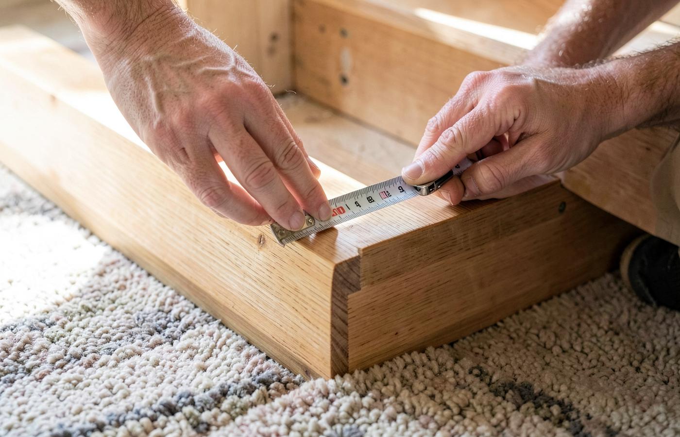 MeasurementWhat Width Should a Stair Runner Be?How to set runner width and side margins from your stair width, stringers, balusters and pattern.
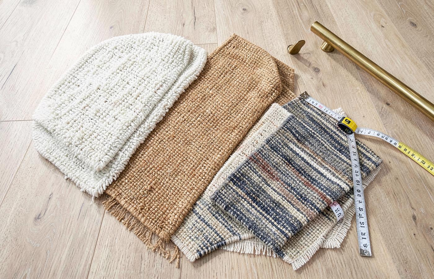 BuyingBest Carpet for a Stair RunnerThe specification checklist — fibre, pile, density, backing, width and pattern repeat — for stair-worthy carpet.
- DesignBordered Stair Runners: Design & Fitting GuideA complete guide to bordered stair runners, covering whipped vs taped edges, width ratios, winder mitring, and how to choose the right contrast for your hallway.
- DesignPatterned Stair Runners: Style & Fitting GuideA comprehensive guide to patterned stair runners. Learn about scale, pattern matching on winders, and how to balance bold designs with your hallway decor.