Colour Guide
The luxury guide to cream stair runners
Cream is the colour of pure luxury. It brings an unparalleled sense of light, softness, and sophistication to a home, acting as a bright canvas for your interior design.
Written by the StairRunner.co editorial team · Updated 4 September 2026
The aesthetic of the cream runner
There is something undeniably "high-end" about a cream runner. It suggests a home that is well-cared for and peaceful. In narrow Victorian hallways or dark, enclosed stairwells, a cream runner acts like a series of mirrors, bouncing every scrap of available light up and down the flight. It can make a cramped space feel grand and a dark space feel airy.
Cream is also the ultimate neutral. It works with every possible wall colour, from the deepest navy to the palest pastel. It doesn't impose a style; it enhances whatever style you have chosen. Whether your home is a minimalist modern build or a traditional country cottage, cream fits.
Navigating the cream spectrum: Ivory, Pearl, and Vanilla
Not all creams are the same. The undertone is everything.
Ivory and Pearl: The Cool Creams
These have a hint of grey or blue. they feel very "clean" and modern. They work best with cool-toned paints and modern architectural details. However, they can feel a little clinical if not balanced with warm textures.
Vanilla and Clotted Cream: The Warm Creams
These have yellow or peach undertones. They are the classic choice for a cosy, welcoming home. They pair beautifully with natural wood and brass hardware. Be careful, however, as these can look "yellowed" under certain old-fashioned light bulbs.
| Shade | Undertone | Best Wood Pairing | Risk Factor |
|---|---|---|---|
| Ivory | Cool / Grey | Dark Walnut / Black | Can look 'cold' |
| Vanilla | Warm / Yellow | Oak / Pine | Can look 'dirty' in low light |
| Pearl | Neutral / White | Any | Shows every mark |
The practical reality: living with cream
We cannot ignore the maintenance. Cream is the least forgiving colour for a staircase. Every bit of lint, every muddy paw print, and every drop of coffee will be visible.
Specify for Cleanability: If you must have cream, look at high-end polypropylene or nylon. These "solution-dyed" fibres mean the colour is built into the plastic, so you can clean it more aggressively than wool. If you prefer wool, it must be the highest quality, densely packed pile to prevent dirt from sinking deep into the base of the carpet. Learn more about washable and cleanable options.
The "Second Staircase" Rule: Many designers suggest cream only for the staircase that leads from the first to the second floor, rather than the primary flight that connects to the front door. This keeps the most vulnerable carpet away from the highest-traffic "mud zone."
Styling and Safety
A solid cream runner can be difficult to see on a white or light-coloured staircase. For safety, a contrasting border (like a grey, tan, or even black tape) is highly recommended. This provides the visual boundary that makes the steps safe to navigate.
Rods: Cream runners look spectacular with stair rods. Brass rods add a regal, traditional feel, while black rods create a sharp, modern contrast that is very popular in contemporary renovations. See rod styles.
Summary
A cream stair runner is a bold statement of elegance. It transforms a staircase into a glowing architectural feature, bringing light and luxury to the heart of the home. While it demands respect and regular care, for many, the sheer beauty of a cream flight is well worth the effort.
Frequently asked questions
- Is cream too impractical for a stair runner?
- It is the most demanding colour in terms of maintenance. However, for households without pets or small children, or for stairs that aren't the primary entrance route, the aesthetic reward of a cream runner is often worth the effort.
- How do I keep a cream runner clean?
- A strict 'no shoes' policy is essential. You should also choose a high-performance synthetic or a wool runner with a high-quality stain treatment. Regular professional cleaning is a must.
- What is the difference between cream and beige?
- Cream is lighter and has more 'yellow' or 'white' in it. Beige is darker and has more 'brown' or 'grey.' Cream is generally considered more luxurious and formal, while beige is more practical.
- Which stair rods look best with cream?
- Everything works with cream. Brass or gold rods create a very classic, 'expensive' look. Black rods provide a sharp, modern contrast. Chrome rods look clean and contemporary.
- Can I use a cream runner on white stairs?
- Yes, but you need to be careful with the tones. If the white paint is a 'cool' white and the runner is a 'warm' cream, the runner can end up looking 'dirty' or yellowed. Match your undertones carefully.
- Can I use bleach on a cream runner?
- Only if it is a 100% solution-dyed polypropylene runner. Never use bleach on wool, as it will dissolve the natural proteins in the fibre and destroy the carpet. For wool, use a dedicated wool-safe spot cleaner.
- How do I handle pet hair on a cream runner?
- Cream is actually better than dark colours for hiding light-coloured pet hair (like from a Golden Retriever or a light-coloured cat). However, dark hair will show up instantly. Regular vacuuming with a powered brush head is the best solution for all pet hair.
- What is the 'Rule of Three' for cream runners?
- Designers suggest that if you have a cream runner, you should have at least two other cream elements in the hallway—such as a cream lampshade, a piece of cream ceramic, or cream-toned artwork—to make the colour feel integrated rather than accidental.
Related guides
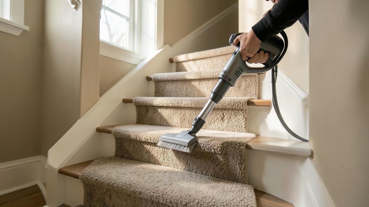 CareCleaning and Caring for a Stair RunnerRoutine vacuuming, spill response by fibre type, slipping and fraying, and when to call a professional.
- DesignChoosing a Stair Runner ColourHow light, adjacent flooring, trim colour, traffic and dirt should drive the colour decision.
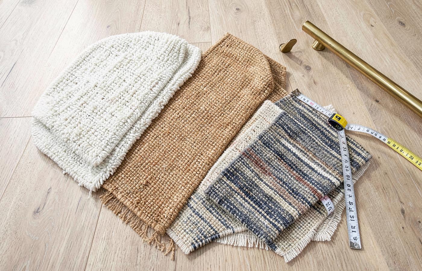 MaterialsWool Stair RunnersWhy wool holds its shape on stairs: crimp, twist, blends, staining, moths, shedding and honest limitations.
Advanced technical considerations for stair performance
Beyond colour and aesthetic, the physical performance of a runner on a staircase is a matter of engineering. The nosing (the edge of the tread) is the highest-wear point of any flight. When specifying a runner, the pile density at the nosing is what determines how long the appearance remains uniform. A high-density, low-profile weave is always superior to a loose, high-pile one, regardless of colour.
Furthermore, the interaction between the runner and the underlay is a critical, often overlooked variable. A dense, firm underlay prevents the carpet from 'ballooning' over the nosing, which not only causes premature wear to the carpet backing but also creates a trip hazard. Always pair your runner with a dedicated stair-specific underlay, never a generic 'room' underlay.
Finally, consider the 'tensile' requirements of a runner. It must be stretched tight enough to remain flat but not so tight that it places undue stress on the staples or rods. The backing material itself—whether jute, action back, or felt—will determine how well the runner retains its tension over the life of the installation. A synthetic backing generally offers better stability than a natural jute backing, which can be sensitive to humidity changes.
By focusing on these technical layers—the subfloor preparation, the nosing durability, and the tensioning strategy—you ensure the runner is not just a visual choice but a long-term architectural investment in the home.
The architectural impact of cream: Creating the 'Glow' effect
Cream is not just a colour; it is a tool for architectural lighting. In the UK, where Victorian and Edwardian hallways are often long, narrow, and starved of natural light, a cream runner acts as a continuous reflector. When light hits the surface of a cream wool or synthetic runner, it doesn't just sit there; it bounces upwards onto the walls and ceiling. This 'glow' effect can make a ceiling feel higher and a hallway feel wider. Architects often specify cream for internal, windowless staircases precisely for this reason. It transforms a dark, functional shaft into a luminous feature that draws people upwards. The key is to ensure the runner is wide enough—a narrow cream strip in a dark hallway can look like a faint line, whereas a generous width creates a sea of light.
Technical challenges in cream installations: The 'Dirty Nosing' problem
One of the most common issues with cream runners is what professionals call 'soiling at the nosing.' The nosing is the edge of the stair tread where your foot makes first contact. Because this point takes the most pressure and friction, dirt is ground deeper into the fibres here than anywhere else. On a cream runner, this shows up as a greyish line along every step. To combat this, installers recommend using a higher-density underlay specifically at the nosing to support the carpet. Additionally, choosing a runner with a 'heathered' cream—where ivory fibres are mixed with slightly darker oatmeal or pearl tones—can disguise this wear significantly better than a solid, flat cream. It is also advisable to use a stair rod, which helps hold the runner tight against the riser, reducing the 'bellows' effect that sucks dust into the carpet every time someone steps on it.
Historical context: Cream as the hallmark of the grand entrance
Throughout the history of British interior design, cream has been the go-to colour for the 'grand entrance.' In the stately homes of the 18th and 19th centuries, cream stone or light-coloured carpets were used to signal cleanliness, wealth, and a household that had the staff to maintain such a delicate surface. Today, that association remains. A cream runner signals a level of pride in the home. It suggests a space that is managed and cherished. While we no longer have a fleet of staff to scrub the stairs, the modern equivalent is the 'no-shoes' policy and the high-tech stain-resistant treatments that allow us to achieve the same regal look with a fraction of the labour.
Cream and the concept of 'Hygge' in British hallways
While 'Hygge' is a Danish concept, the British hallway is where we often need it most. Coming in from a grey, rainy afternoon into a hallway featuring a soft, cream wool runner is a transformative experience. The warmth of the cream tone—especially those with a hint of vanilla or honey—counteracts the cool, blueish light of the UK climate. It creates a 'buffer zone' between the harsh exterior world and the private sanctuary of the home. Designers often pair cream runners with warm-toned LED lighting (around 2700 Kelvin) to enhance this effect, making the staircase look like a warm, inviting path through the centre of the house.
Advanced maintenance: The seasonal cleaning cycle for pale runners
For a cream runner, maintenance should be seasonal. In the winter, the primary threat is 'damp soiling'—moisture from the air and clothing that traps fine dust. During these months, more frequent vacuuming with a high-HEPA filter machine is essential. In the summer, the threat is 'dry grit' and UV fading. While cream is less prone to visible fading than navy or red, the backing of the carpet can become brittle if exposed to intense summer sun through a skylight. Professional cleaning should be scheduled for late spring, to remove the salt and grit tracked in during the winter months, ensuring the runner looks its best for the bright light of summer. Always insist on a 'low-moisture' cleaning method to prevent the jute backing from shrinking.
The impact of different weaving techniques on cream shades
A cream shade looks vastly different depending on how it is woven. A 'Wilton' weave cream runner will have a very structured, precise look, where the light hits the pile evenly. A 'Flatweave' or 'Bouclé' cream runner, however, will have more texture and 'chatter' in the surface. This texture creates tiny shadows within the weave, which can actually make the cream look deeper and more interesting. For those worried about marks, a bouclé weave is far superior to a velvet or plush pile, as the loops are more resilient to crushing and the shadows help to mask the small specks of dust that are inevitable on a light-coloured floor.
Coordinating cream with lighting: CRI and colour temperature
If you invest in a cream runner, you must also invest in your lighting. The Colour Rendering Index (CRI) of your hallway bulbs will determine how your runner looks. A low-CRI bulb will make a beautiful ivory runner look like a flat, muddy grey. Look for bulbs with a CRI of 90 or above. Furthermore, the colour temperature is vital. A 'cool white' bulb (4000K+) will make a cream runner look clinical and blueish, while a 'very warm' bulb (2400K) might make it look overly yellow or 'nicotine-stained.' The sweet spot is 2700K to 3000K, which brings out the richness of the cream while keeping it looking fresh and clean.
Future-proofing your cream runner: Treatments and protectors
Modern textile science has made cream runners more viable than ever. Beyond standard stain guards, there are now 'encapsulation' treatments that coat each individual fibre in a microscopic shield. This doesn't just stop liquids from soaking in; it also stops dry soil from 'keying' into the fibre surface, making vacuuming significantly more effective. When ordering a cream runner, ask if the treatment was applied at the mill (which is more durable) or if it will be sprayed on after installation. Mill-applied treatments are generally superior as they cover the entire length of the yarn, including the parts that are eventually tucked into the weave, providing a deeper level of protection.
The psychology of a light-coloured ascent
Psychologically, we are drawn to light. By placing a cream runner on a staircase, you are creating a 'path of light' that subconsciously encourages movement between floors. In homes with multiple levels, this can make the upper floors feel more integrated and accessible. A dark, carpeted staircase can feel like a barrier—a heavy climb—whereas a light-coloured ascent feels effortless. This is particularly important in multi-generational homes where making the stairs feel 'approachable' can encourage older residents to move between floors more freely, provided that safety contrasts are maintained at the nosing.
Designing for the 'Fifth Wall': The stairs from above
We often design stair runners from the perspective of someone standing in the hallway looking up. However, in modern homes with galleries or open landings, the staircase is often viewed from above—the 'fifth wall.' A cream runner from this angle creates a clean, graphic ribbon that defines the architecture of the house. It acts as a sculptural element. When viewing from above, the consistency of the cream is what matters; any irregularities in the installation or maintenance will be visible. This is why professional fitting—ensuring every riser is perfectly vertical and every tread is perfectly flat—is even more critical for light-coloured runners.