Contemporary Design
Two-tone stair runners: Defining space with contrast
The two-tone runner is the perfect middle ground between the simplicity of a plain carpet and the complexity of a pattern. By using two shades, you can highlight the architectural lines of your staircase while maintaining a clean, modern aesthetic.
Written by the StairRunner.co editorial team · Updated 4 September 2026
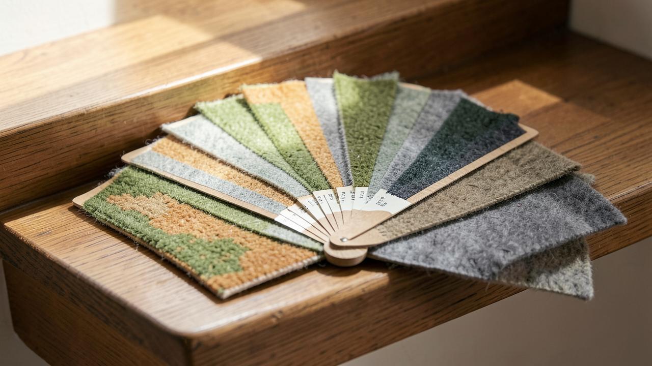
The anatomy of a two-tone runner
A two-tone runner is defined by the intentional use of two contrasting colours to create a structural visual effect. Unlike a multi-coloured pattern, which might use five or six colours in a complex design, the two-tone approach is about 'framing'. It mimics the classic architectural principle of the 'architrave'—creating a definitive border that separates one area from another.
There are two primary ways to achieve this look:
- Applied Borders: You take a single-coloured runner and add a contrasting edge finish, such as a cotton tape or a whipped yarn. This gives you the most control over the exact shades and the width of the contrast. See our bordered stair runner guide for technical details.
- Integral Weave: The carpet itself is woven using two different coloured yarns. This could be a herringbone, a stripe, or a 'salt and pepper' stipple. The two tones are woven into the fabric, providing a more subtle and integrated look.
Why contrast matters on stairs
Contrast is not just a design choice; it is a functional one. On a staircase, the edge of each step (the nosing) is a potential trip hazard. A two-tone runner can be used to highlight these edges. For example, a runner with a dark central field and a lighter border (or vice versa) provides a clear visual signal of where the carpet ends and the timber begins, making the stairs safer to navigate in low light.
From a design perspective, contrast adds 'depth'. A single-coloured runner can sometimes look like a flat strip of fabric. A two-tone runner, however, feels three-dimensional. It catches the eye and draws it up the staircase, making the stairs a focal point rather than a background element.
Popular two-tone colour palettes
Choosing your two tones is the most creative part of the process. Here are some proven combinations:
| Combination | Aesthetic Effect | Practical Benefit |
|---|---|---|
| Charcoal & Light Grey | Sophisticated, modern, industrial | Hides almost all household soil; very forgiving |
| Navy & Cream | Classic, nautical, crisp | The dark navy provides a strong anchor for a bright hallway |
| Oatmeal & Black | High-contrast, graphic, bold | The black border hides the edge-wear that can happen near the balustrade |
| Sage Green & Stone | Organic, calming, country-style | Blends beautifully with natural wood stairs |
| Chocolate & Taupe | Warm, luxurious, traditional | Creates a very cosy, 'club-like' feel in the home |
Light field vs. Dark field: The great debate
Should the lighter colour be in the middle or on the edges? Each approach has a different effect on the space.
Light Central Field with Dark Border: This is the most traditional and practical choice. The dark border takes the brunt of the dust that accumulates near the skirting boards and hides the edges of the carpet. The light centre makes the staircase feel airy and open.
Dark Central Field with Light Border: A more modern, 'reverse' look. This creates a very strong vertical line up the centre of the stairs. It is excellent for making a wide staircase feel more intimate. However, be aware that a light border will show soil more quickly if you tend to walk near the edges of the stairs.
Texture as the 'Second Tone'
Two-tone isn't always about colour; it can be about texture. A 'dual-texture' runner might use a flat-woven sisal for the border and a soft wool pile for the centre. Or a runner might be entirely one colour but use a loop pile for the field and a cut pile for the border.
This approach provides a sophisticated, tactile contrast that is only visible when the light hits it at a certain angle. It is the ultimate 'quiet luxury' for a staircase. If you are interested in material combinations, check out our guide on wool vs synthetic stair runners.
Two-Tone Runners and Architectural Styles
The two-tone look adapts remarkably well to different house types:
- Victorian/Edwardian: Use a traditional wool runner in a rich tone (burgundy or navy) with a black or dark brown border to complement dark wood banisters.
- Modern/Minimalist: Choose a monochromatic two-tone, such as white and light grey, with no stair rods for a clean, 'architectural' finish.
- Coastal: Pair a natural jute or sisal field with a light blue or white cotton border. See coastal stair runners for more inspiration.
- Industrial: A grey concrete-coloured runner with a black leather border creates a tough, functional aesthetic.
The Impact of Lighting on Two-Tone Definition
Lighting plays a transformative role in how a two-tone runner is perceived. Because these runners rely on the relationship between two specific shades, the Color Rendering Index (CRI) of your hallway bulbs can significantly alter the contrast. In a hallway with low-CRI LED bulbs, a subtle navy and charcoal two-tone might merge into a single dark mass, losing the architectural intent of the design.
For high-contrast combinations, such as cream and black, direct spotlights can create harsh shadows that confuse the eye, especially at the nosing of the steps. We recommend diffused lighting or wall sconces that cast a soft glow across the treads. This allows the two tones to be clearly distinguished without creating visual 'noise'. If your staircase is particularly dark, a two-tone runner with a lighter central field acts as a natural light-well, reflecting ambient light upwards and making the transit safer and more pleasant.
Balancing Two-Tone Runners with Hallway Wall Colours
A common mistake is to view the stair runner in isolation. A two-tone runner introduces two new colours into your palette, which must interact harmoniously with your wall finish and skirting boards. As a general rule of thumb, one of the tones in your runner should 'speak' to a colour already present in the room.
If you have white skirting boards, a runner with a white or off-white border creates a very clean, integrated look. However, if you have dark timber skirting, a dark border on the runner can help 'ground' the staircase, making it feel like a permanent part of the home's structure rather than an added textile. For walls, a neutral two-tone runner (grey/black or beige/brown) allows you to be bolder with paint choices, such as deep forest greens or heritage blues, without the hallway feeling overcrowded.
Transitioning Two-Tone Runners Across Landings
One of the most complex aspects of two-tone design is the transition from the stairs to the landing. Should the two-tone effect continue across the flat surfaces, or should you switch to a single-tone carpet?
In most cases, continuing the two-tone look across the landing provides the best visual continuity. If you are using a bordered runner, the border should follow the perimeter of the landing, effectively 'framing' the entire walkway. This is particularly effective in large, open hallways. If the landing is small or oddly shaped, you might choose to 'bleed' the central field colour across the entire landing, but this can sometimes make the stairs feel disconnected from the rest of the floor. Always plan the join at the top step (the 'landing nose') carefully to ensure the border lines align perfectly.
Installation Considerations for Two-Tone Runners
Precision is paramount with two-tone runners. Because the transition between the two colours is so sharp, any 'wonkiness' in the installation will be immediately visible.
Centring: The runner must be perfectly centred on the flight. If it is even 5mm off to one side, the relationship between the border and the exposed wood will look unbalanced.
Mitring at Turns: If you are using a bordered two-tone runner, the corners must be mitred with extreme care. Any gap or overlap in the border at a winder turn will break the clean 'frame' effect. We always recommend using a specialist fitter for bordered work. See installation tips.
Maintenance of Contrast
The main challenge with a two-tone runner is maintaining the 'purity' of the contrast. Over time, the lighter section may darken due to soil, and the darker section may lighten due to lint, causing the two tones to 'muddy' together.
- Frequent Vacuuming: Focus on the transition line between the two colours. Dust often settles in the slight ridge where the border meets the field.
- Dedicated Cleaning: You may need to treat the two sections differently. A wool-safe cleaner for the centre and a fabric-specific cleaner for a cotton border tape.
- Edge Protection: Use a fabric protector on the lighter parts of the runner to prevent soil from bonding with the fibres.
Two-Tone Runners and Stair Rods
Stair rods can either enhance or distract from a two-tone design. If your runner has a high-contrast border, a busy or ornate rod can make the staircase look 'cluttered'. A simple, sleek rod in a finish that matches the darker tone of the runner is often the best choice. For example, if you have a black border, a matte black rod will look incredibly seamless. Check our stair rods guide for pairing ideas.
The Psychological Impact of Structured Design
Beyond aesthetics, the two-tone runner offers a sense of psychological comfort. The human brain is naturally drawn to 'containers'—we like spaces that have clear boundaries. A two-tone runner provides this boundary vertically through the home. It defines the 'path' clearly, which can be particularly beneficial for children or the elderly who may find a uniform, single-colour staircase disorienting. By providing a clear visual 'track', the two-tone design reduces the cognitive load required to navigate the stairs, making the home feel more organized and safe.
This sense of order is why two-tone runners are so frequently found in high-end hotels and stately homes. It is a design language that signals 'prestige' and 'care'. In a domestic setting, it elevates the humble staircase from a utility to a gallery-like feature.
Sustainability and Quality
A two-tone runner is often a 'bespoke' item, meaning it is made to order rather than mass-produced. This allows you to select high-quality, sustainable materials. Choosing a 100% natural wool field and a 100% cotton border tape ensures that your runner is fully biodegradable at the end of its life. Furthermore, a well-made two-tone runner is a classic design that won't go out of style, reducing the likelihood of it being replaced prematurely for aesthetic reasons.
Final Thoughts on the Two-Tone Aesthetic
The two-tone stair runner is a masterclass in 'structured' design. It brings a sense of order, safety, and architectural intent to your home. Whether you choose a bold, high-contrast look or a subtle, tonal variation, the two-tone approach is a guaranteed way to make your staircase feel considered and bespoke.
Before you buy, we recommend getting samples of both colours and placing them side-by-side on your stairs. Check them at night under your hallway lights—sometimes a contrast that looks great in daylight can disappear or become too harsh under artificial light. For more advice on colour selection, read choosing the right stair runner colour.
Frequently asked questions
- What is a two-tone stair runner?
- A two-tone runner uses two distinct colours or shades to create a design. This can be achieved through a contrasting border (taped or whipped) or a dual-weave carpet where two different coloured yarns are woven together to create a subtle, textured pattern.
- Should the darker colour be on the inside or the outside?
- Usually, the darker colour is used for the border (outside) to frame the runner and hide edge-wear. However, a dark central field with a lighter border can create a striking 'modern' look that draws the eye into the centre of the flight.
- Do two-tone runners work on winder stairs?
- Yes, they are particularly effective at defining the geometry of complex turns. However, if the two tones are created by a border, the mitring must be perfect to ensure the contrast lines remain consistent around the corner.
- What are the best colour combinations for a two-tone runner?
- Classic combinations include navy and cream, charcoal and silver-grey, or forest green and oatmeal. For a more subtle look, try two shades of the same colour, such as a light taupe field with a dark mocha border.
- Are two-tone runners more expensive?
- If the two-tone effect is achieved by adding a separate border tape, yes, it adds to the material and labour cost. If it is a single piece of carpet woven with two colours, the price is usually comparable to a standard patterned runner.
- Can I achieve a two-tone look with a plain runner?
- Yes, by choosing a plain runner and adding a high-contrast whipped or taped edge. This is one of the most popular ways to create a bespoke, high-end look on a moderate budget.
- Can I use two-tone runners on open-tread stairs?
- Yes, but with caveats. On open-tread stairs, the 'wrap' of the runner is visible from behind. A two-tone runner with a taped border looks excellent from the front, but you must ensure the border tape is neatly finished on the underside or choose a dual-weave carpet that looks consistent on both sides.
- Do two-tone runners work with patterned wallpapers?
- They can, provided one of the tones in the runner complements a primary or secondary colour in the wallpaper. A two-tone runner acts as a 'visual anchor', so using a neutral two-tone (like grey and black) can actually help ground a busy, patterned hallway.
Related guides
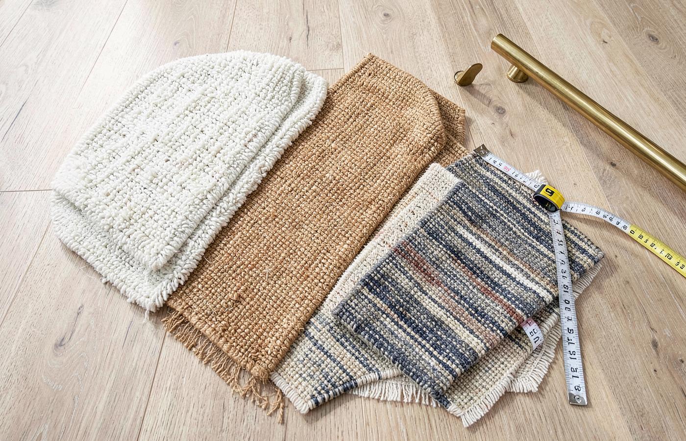 MaterialsStair Runner Materials ComparedWool, nylon, polypropylene, sisal and jute judged on stair-specific wear, comfort, cleaning and safety.
- DesignChoosing a Stair Runner ColourHow light, adjacent flooring, trim colour, traffic and dirt should drive the colour decision.
- DesignBordered Stair Runners: Design & Fitting GuideA complete guide to bordered stair runners, covering whipped vs taped edges, width ratios, winder mitring, and how to choose the right contrast for your hallway.