Style
Black and white stair runners: a buying guide
Black and white is one of the most versatile palettes for a staircase, moving comfortably between period and contemporary hallways, but the strong contrast means pattern scale, fibre and maintenance all need more thought than a single-colour runner.
Written by the StairRunner.co editorial team · Updated 4 September 2026
Why black and white works on stairs
A staircase is often the most architectural element in a hallway, with a clear rhythm of treads and risers repeating up the flight. Strong contrast emphasises that rhythm rather than competing with it, which is why black and white patterns read so well on stairs specifically, even in houses where the owner would never choose such a bold contrast for a flat floor. The repetition of the pattern down each step also reinforces the sense of movement up the staircase, giving even a plain staircase a strong graphic presence.
Choosing the right pattern scale
| Pattern type | Visual effect | Best suited to |
|---|---|---|
| Fine houndstooth or dogtooth | Textured, subtle from a distance, graphic close up | Narrow or period staircases, traditional hallways |
| Bold chevron or herringbone | Strong directional movement up the flight | Wide staircases, contemporary schemes |
| Wide stripe | Clean, architectural, emphasises the length of the flight | Straight flights with little visual clutter elsewhere |
| Large geometric or trellis | Statement pattern, needs a full step width to read clearly | Wider stairs where the repeat is not cut off by borders |
| Small fleck or tweed within a mostly plain field | Subtle, hides everyday soiling well | Households wanting the palette without a strong pattern |
As a general rule, a pattern repeat should be visible and legible on a single tread rather than only making sense across several steps at once. On a narrow staircase, a large-scale geometric can be cut awkwardly by the tread width and lose its intended shape; a finer pattern such as houndstooth avoids this problem because its repeat is small enough to sit comfortably within almost any tread size.
Balancing black and white for your stairwell
The overall balance between black and white in a pattern changes how a stairwell feels, not just how the runner itself looks. A stairwell with little natural light benefits from a runner where white or cream is the dominant tone, with black used for definition rather than as the main field, since this reflects more light back into the space. A bright, well-lit stairwell can carry a runner that is mostly black with white detailing, since there is enough ambient light in the space to prevent the flight feeling heavy or closed in.
Fibre and construction choices
The strong contrast in a black and white runner makes fibre choice more consequential than it would be for a subtler colourway, because any unevenness in colour, wear or soiling is more visible against such a stark palette. Solution-dyed nylon is a dependable choice for the white or pale sections, since the colour is carried through the fibre and resists the subtle yellowing or greying that can develop in some undyed or surface-treated pale fibres over years of light exposure and cleaning. Wool gives black and white patterns a particular depth and a slightly softer, less stark contrast than synthetic yarns, which some households prefer for a period hallway. Whichever fibre is chosen, a cut pile with reasonable density will show the pattern's edges more crisply than a looped construction, where the pattern can look slightly blurred at each colour boundary. For a wider comparison of fibre performance, see wool versus synthetic stair runners.
Where a black and white runner fits your existing hallway
Because black and white is a neutral palette in the sense that it will not clash with any other colour, it is one of the more forgiving choices to introduce into a hallway with existing colours you are not planning to change. It pairs comfortably with warm timber floors, painted woodwork in almost any colour, and patterned or plain wallpaper, provided the wallpaper itself is not also highly patterned in a competing scale. Where a hallway already has a black and white or monochrome tiled floor at the base of the stairs, a runner in the same palette, even in a different specific pattern, tends to read as a considered pairing rather than a coincidence.
Maintenance realities of a high-contrast runner
Both extremes of the palette have their own maintenance considerations. Pale or white sections show dust, hair and everyday grime more readily than a mid-tone would, particularly in the centre of each tread where footfall concentrates. Black sections, contrary to what many people assume, also show dust, lint and pet hair clearly, since light-coloured debris stands out sharply against a dark ground. The practical result is that a black and white runner generally needs vacuuming a little more often than a mid-tone runner of the same traffic level, simply because any accumulated debris is more visible against either extreme of the palette rather than being disguised by it.
- Vacuum more frequently in the centre of the tread. This is where footfall concentrates dust and where contrast makes any buildup most visible.
- Blot spills immediately rather than rubbing. Rubbing can push a stain further into the pile and, on a pale section, spread it wider than the original mark.
- Have the flight professionally cleaned periodically. This lifts embedded soil that regular vacuuming cannot reach and refreshes the crispness of the contrast.
- Check cleaning products are suitable for the specific fibre. Some cleaning products are formulated for synthetic fibres only and can affect wool colour if used incorrectly.
Full guidance on cleaning method by fibre type is in cleaning and caring for a stair runner.
Border and binding choices
A separately coloured border can either sharpen or soften a black and white pattern, depending on which colour is chosen and how wide the border is. A black border around a busy black and white pattern tends to contain the pattern and gives the eye a clear edge to rest on, which is particularly useful for a bold or large-scale geometric. A cream or white border achieves a lighter, more open feel and works especially well where the surrounding treads and skirting boards are also pale. Where the pattern itself already includes a strong border effect, such as a woven trellis with a natural frame, an additional applied border may be unnecessary and can make the finished flight look busier than intended. More on the decision itself is in bordered stair runners.
Black and white in period versus contemporary staircases
In a Victorian or Edwardian hallway, black and white has genuine historical precedent, particularly in geometric tile-inspired patterns that echo the encaustic tiled floors common to the period. A runner that picks up this visual language, paired with a traditional stair rod fixing, sits very comfortably in this kind of house. In a contemporary setting, the same palette reads quite differently when expressed as a clean stripe, a simple herringbone, or a minimal fleck within an otherwise plain field, giving the stairs a graphic, architectural quality without any period reference at all. The palette is the constant; the pattern style is what signals the era.
Combining black and white with an accent colour
A black and white runner does not have to remain strictly monochrome. A single accent colour, introduced through a woven pinstripe, a contrasting binding, or brass stair rods against the pattern, can lift an otherwise stark palette without undermining its clarity. The key is restraint: one accent colour used sparingly reads as a deliberate detail, while two or more competing accents tend to dilute the graphic strength that makes black and white effective in the first place. A narrow red or mustard pinstripe within a black and white herringbone, for instance, gives the eye a point of interest without changing the overall character of the staircase.
Common mistakes to avoid
- Choosing a pattern scale that does not fit the tread width. A large geometric cut awkwardly at the nosing can look unintentional rather than bold.
- Underestimating how visible dust is against black. Households expecting a dark colour to hide everything are often surprised by how much lint and hair still shows.
- Pairing with an equally bold patterned wallpaper. Two strong graphic patterns in close proximity usually compete rather than complement each other.
- Choosing an unsuitable pale fibre. Some undyed natural or lightly treated pale fibres can shift in tone over years of light exposure; a solution-dyed synthetic avoids this risk.
- Ignoring the border decision. Leaving the border as an afterthought on a high-contrast pattern often undersells the finished result compared with a considered choice.
How lighting changes the perceived contrast
Artificial light at night can compress the apparent contrast between black and white, making a crisp daytime pattern look flatter and greyer under a warm bulb. Where a stairwell relies mainly on artificial light in the evenings, it is worth viewing a sample under that exact lighting before ordering, since the graphic effect that sold the design in a bright showroom may soften considerably once fitted.
A short checklist before ordering
- Confirm the pattern repeat is legible on a single tread of your actual stair width.
- Decide whether the runner should be mostly white or mostly black based on how much natural light your stairwell has.
- Choose a fibre that will hold the pale sections without yellowing over time.
- Decide on a border colour deliberately rather than defaulting to whatever the supplier offers first.
- Plan for slightly more frequent vacuuming than you would with a mid-tone runner.
Frequently asked questions
- Does a black and white runner show dirt more than a coloured one?
- White or pale sections show soiling and dust faster than a mid-tone would, but black sections hide it less than people expect, since dust and pet hair show clearly against a very dark ground. The contrast itself, not either colour alone, is what needs managing with regular vacuuming.
- Will a bold black and white pattern make my hallway feel busy?
- It depends on the scale of the pattern and what surrounds it. A large, simple geometric reads as graphic and confident; a small, dense repeat can feel busier, especially in a narrow hallway. Keeping the walls and any adjacent flooring plain gives the pattern room to work without competing for attention.
- Is black and white a period or contemporary look?
- Both. Bold geometric black and white patterns have a long history in Victorian and Edwardian hallways, often alongside tiled floors, while the same palette in a cleaner stripe or chevron reads as distinctly contemporary. The pattern style, not the palette, decides which era it evokes.
- What fibre holds a crisp white best on stairs?
- Solution-dyed synthetics resist the yellowing that can affect some undyed natural fibres over time and clean more predictably. Wool can also work well but needs more careful attention to spot cleaning, since a very pale wool section will show marks that a synthetic of the same colour sheds more easily.
- Should the border match the black or the white in the pattern?
- Either can work, but a black border tends to ground a busy black and white pattern and disguise fitting cuts more forgivingly, while a white or cream border feels lighter and works well where the surrounding treads and skirting are also pale.
- Can I use a black and white runner on a narrow, dark staircase?
- Yes, but choose the balance of black to white carefully. A pattern that is mostly white with black detailing will help a dark stairwell feel brighter, while a pattern that is mostly black will deepen the existing darkness rather than lifting it.
Related guides
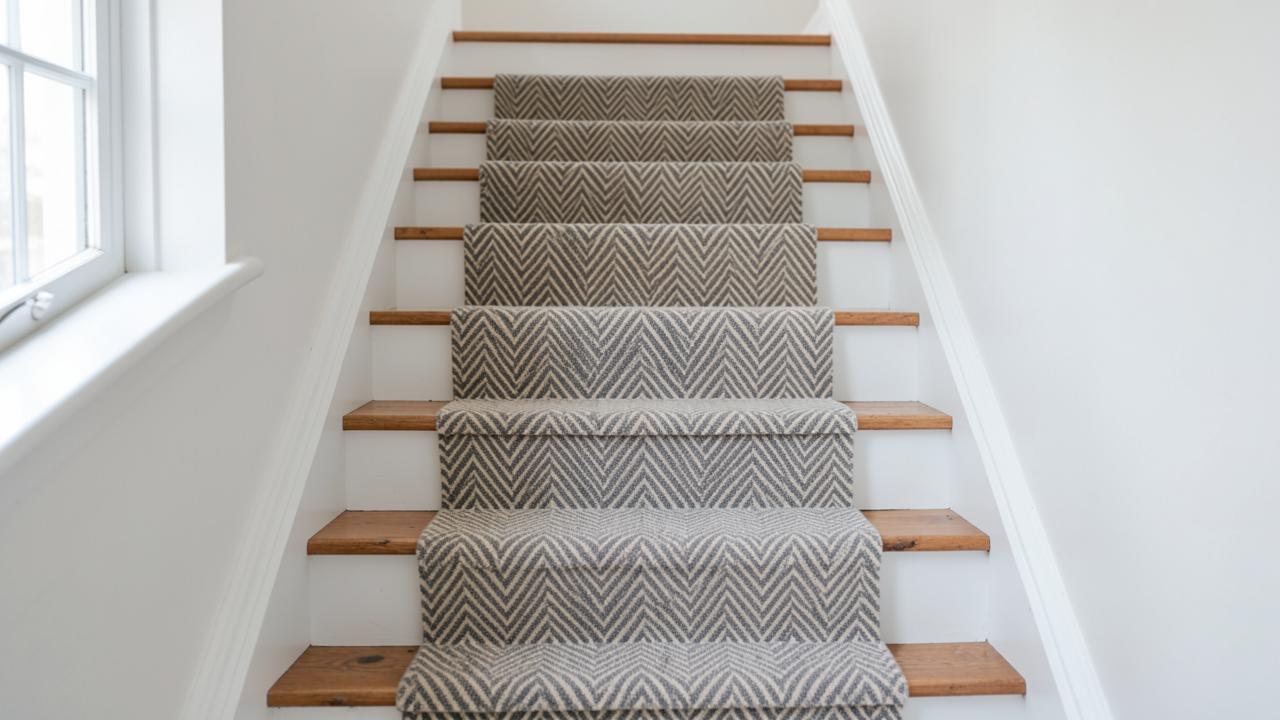 DesignStriped Stair RunnersStripe direction, repeat matching, widening and narrowing effects, and the fitting challenges stripes create.
- DesignBordered Stair Runners: Design & Fitting GuideA complete guide to bordered stair runners, covering whipped vs taped edges, width ratios, winder mitring, and how to choose the right contrast for your hallway.
- DesignGeometric Stair Runners: A Buying GuideHow to choose a geometric stair runner, from scale and repeat to colour, fibre and fitting, so the pattern reads correctly on real treads and risers.
- DesignPatterned Stair Runners: Style & Fitting GuideA comprehensive guide to patterned stair runners. Learn about scale, pattern matching on winders, and how to balance bold designs with your hallway decor.