Colour Choice
Neutral stair runners: The foundation of a timeless home
Neutral doesn't mean boring. A well-chosen neutral stair runner provides the perfect backdrop for your interior, balancing practicality with effortless sophistication.
Written by the StairRunner.co editorial team · Updated 4 September 2026
The enduring appeal of the neutral palette
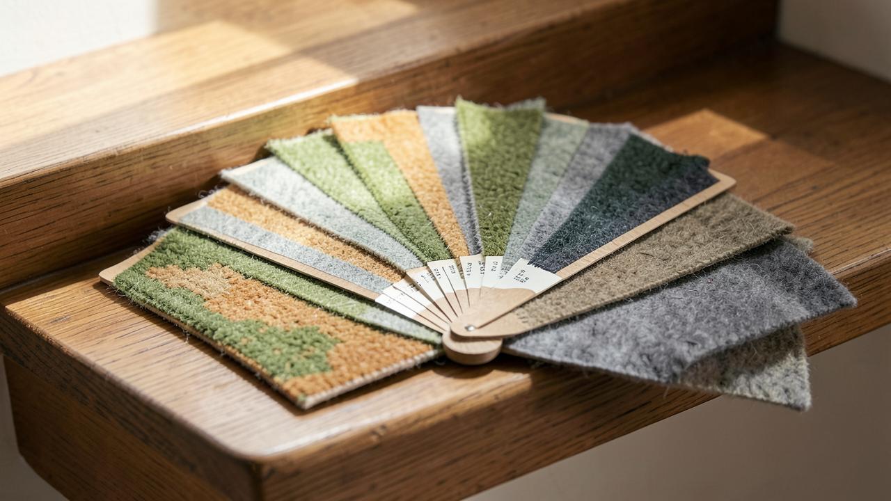
In the world of interior design, the neutral palette is often described as the 'anchor' of a home. When it comes to a staircase—a high-traffic, high-visibility area that connects different zones of a house—a neutral runner acts as a visual bridge. Unlike a bold pattern or a vibrant colour that might clash with upstairs bedrooms or downstairs living areas, a neutral tone flows seamlessly through the space. It provides a sense of continuity that is essential for creating a cohesive home environment. This is particularly important in open-plan homes where the staircase is visible from multiple living zones, each with its own colour scheme.
Neutrality also offers a unique psychological benefit. The hallway and stairs are transitional spaces. Moving from the outside world into the home, or from a social living room to a private bedroom, requires a visual and emotional reset. Soft, earthy neutrals like stone, clay, and sand provide a calming influence, reducing visual noise and making the home feel more grounded. This 'quiet' design allows architectural features like original Victorian spindles, modern oak handrails, or decorative plasterwork to take centre stage without competition. It creates a sense of 'expensive silence' that is highly valued in high-end interior design.
The spectrum of neutrality: Understanding undertones
Neutral is a broad term that encompasses a vast range of tones, each with its own characteristics and practical implications. Understanding the undertones of your neutral choice is the key to a successful installation. A 'cool' grey neutral will have blue or violet undertones and works best in modern, light-filled spaces or homes with a high-tech aesthetic. A 'warm' beige or taupe has yellow or red undertones and is better suited to traditional homes or rooms that need a sense of cosiness and warmth.
| Tone | Undertone | Best Environment | Soil Hiding |
|---|---|---|---|
| Oatmeal / Biscuit | Warm (Yellow/Red) | Traditional, country, family homes. | Excellent; hides most daily grit. |
| Cool Grey / Silver | Cool (Blue/Violet) | Modern, minimalist, urban apartments. | Moderate; shows darker stains easily. |
| Greige (Grey-Beige) | Balanced | Universal; adapts to any lighting. | Very High; the most practical 'all-rounder'. |
| Sand / Stone | Warm (Yellow) | Coastal, airy, bright hallways. | Good; masks fine dust well. |
Choosing the right neutral for your traffic level
Practicality is the hidden strength of the neutral runner. However, not all neutrals are equally forgiving. A very pale cream neutral is effectively a white runner in terms of maintenance and should be treated with the same caution regarding spills and shoe policies (see white stair runners). Conversely, a very dark 'charcoal' or 'espresso' neutral will highlight every piece of white lint, dandruff, or pet hair, much like a dark suit does.
The 'sweet spot' for most busy households is the mid-tone neutral. These are colours that match the general tone of outdoor soil and dust—think of the colour of dried mud, garden stone, or beach sand. These tones allow for a more relaxed cleaning schedule, as they can hide a few days of traffic without looking neglected or 'dirty'. For homes with pets, a multi-tonal neutral (often called a 'heathered' or 'flecked' carpet) is the gold standard. By blending two or three slightly different neutral shades into the same yarn, manufacturers create a surface that is incredibly effective at camouflaging pet hair and minor spots. Check out runners for dogs for more on pet-friendly choices and how to handle sheds.
Natural fibres and the neutral aesthetic
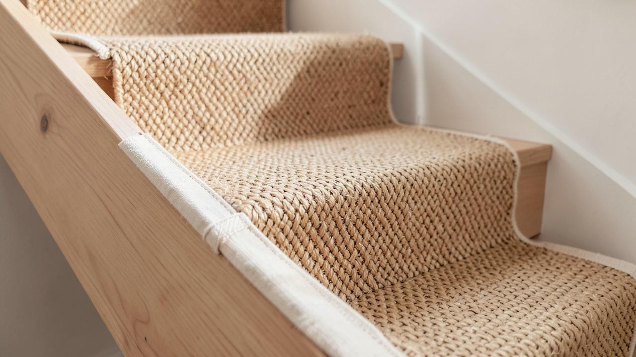
Neutrality and natural fibres are a match made in heaven. Materials like sisal, seagrass, and jute are naturally neutral, coming in shades of tan, green-gold, and brown that no synthetic dye can perfectly replicate. These fibres offer a rugged, organic texture that is highly desirable in modern rustic, 'biophilic', or Scandinavian-inspired interior design. However, natural plant fibres have specific trade-offs regarding comfort and stain resistance that every homeowner should understand before committing.
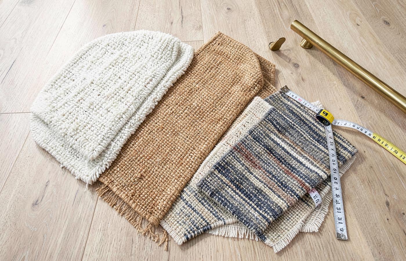
Sisal, for instance, is extremely durable and comes in beautiful neutral weaves like herringbone and panama, but it can be harsh underfoot (not ideal for bare feet) and is notoriously difficult to clean if it gets wet, as water can leave permanent tide marks. Wool, on the other hand, provides the best of both worlds: it can be dyed into any neutral shade imaginable, offers superior comfort and warmth, and has a natural resilience that helps it bounce back from foot traffic. For a deep dive into these choices, see our sisal guide and wool guide for technical specifications.
Lighting and the 'Chameleon' effect of neutral tones
Neutral colours are the most sensitive to lighting conditions of all flooring choices. A taupe runner that looks perfectly balanced in the showroom might turn into a muddy lilac under the cool fluorescent lights of a hallway, or a sickly yellow in the late afternoon sun. This is because neutral pigments are often composed of a complex mix of primary colours, and different light sources will 'activate' those different components. This is why many people find grey carpets looking blue or brown carpets looking pink after installation.
To avoid a costly mistake, it is essential to test samples in your own home environment. Place the sample on the bottom step, the middle step, and the landing. Look at it at 8 AM, 1 PM, and 9 PM with the hallway lights on and off. This will reveal the true character of the neutral and how it interacts with your specific walls. We discuss this process more in how to choose a stair runner. Pay particular attention to how the neutral interacts with your wall colour; a 'greige' runner against a warm beige wall can sometimes make the wall look 'dirty' if the undertones don't align correctly.
Designing with neutral runners: Borders, rods, and definition
Because neutral runners are understated, they provide an excellent opportunity to use accessories to define the space and add a layer of customisation. A neutral runner with a contrasting border—such as an oatmeal runner with a black linen binding—creates a crisp, tailored look that frames the staircase beautifully. This is a classic design technique used to add structure to a hallway without introducing overwhelming colour or busy patterns.
Similarly, stair runner rods can completely change the vibe of a neutral installation. Brass rods add a traditional, warm luxury to a beige runner, while black or pewter rods offer a more industrial, modern feel to a grey one. The rod acts as a piece of 'jewellery' for the stairs, providing the finishing touch that elevates a simple neutral carpet into a bespoke design feature. It also serves a practical purpose by holding the carpet firmly in the crook of the stair, preventing movement that could lead to premature wear.
Neutrality in different architectural styles
Neutral runners are incredibly adaptable across different house ages and styles, making them a safe yet stylish bet for almost any property. In a period property, a thick, plush neutral wool runner respects the history of the house while bringing it into the 21st century. It complements the often-ornate encaustic floor tiles found in period hallways, providing a soft contrast to the hard, patterned floor. In a modern new-build, a flatweave grey runner can emphasise the clean lines and minimalist aesthetic of the architecture, creating a sense of calm and order.
For those with narrow or dark stairs, a light neutral is a powerful tool for opening up the space visually. It reflects more light than a dark wood or a deep-coloured carpet, making the ascent feel less enclosed and more welcoming. Read more about design ideas for different stairs to see how neutrals can work for you, including how to handle winders and landings with neutral tones.
The longevity and 'future-proofing' of the neutral choice
The primary reason most professional designers and estate agents recommend neutrals for stairs is 'future-proofing'. A high-quality stair runner is a significant investment that should last 10 to 15 years. During that time, you might change your wallpaper three times, paint your woodwork, and update your furniture. A bold emerald green runner might look fantastic today, but it limits your choices in five years' time. A neutral runner is a blank canvas that will continue to work regardless of how your personal style evolves. This makes it the most cost-effective choice in the long run. See our cost guide for more on budgeting for your project and understanding the value of neutral flooring.
Maintenance and cleaning for neutral stair carpets
While mid-toned neutrals are forgiving, they still require a consistent maintenance routine to look their best and maintain their 'clean' aesthetic. The key is to prevent the 'greying' of the traffic lane, which is caused by microscopic soil particles bonding with the fibres. Regular vacuuming—at least twice a week—is essential to remove the grit that grinds down the fibres and dulls the colour. For wool neutrals, use a vacuum with a beater bar to lift the pile and remove deep-set dirt. For natural fibres like sisal, a suction-only vacuum is often recommended to avoid fraying the delicate weave.
If a spill occurs, the neutral colour can sometimes make it harder to see the edges of the mark, so be thorough in your blotting process. Avoid using bleach-based cleaners unless you have a 100% polypropylene runner, as these can permanently discolour natural fibres or blended yarns. For more detailed instructions on handling specific stains on neutral backgrounds, refer to our cleaning and care guide.
Safety and visual definition in neutral schemes
One potential downside of a very uniform neutral runner is a lack of 'edge definition'. If the runner is the exact same tone as the stair treads and the hallway floor, it can become a trip hazard for those with poor eyesight or in low light, as the individual steps blend together into a single, confusing 'slope'. To counter this, ensure there is a clear tonal contrast between the runner and the stairs (e.g., a light grey runner on dark wood stairs), or use a contrasting border or stair rods to mark the beginning and end of each step clearly. This is a key part of stair safety and should not be overlooked for the sake of aesthetics alone.
The Role of Underlay in Neutral Runner Longevity
Because neutral runners are often chosen for their clean, smooth look, any pile crushing or 'tracking' is immediately visible. The traffic lane can quickly become a flat, dull stripe if the carpet is not properly supported. This is why the underlay specification is crucial for neutral runners. A high-density rubber or felt-and-rubber crumb underlay provides the necessary resistance to prevent the pile from collapsing under the weight of foot traffic. It also helps to absorb the impact of footsteps, which not only makes the stairs quieter but also protects the backing of the runner from mechanical damage. For a neutral runner, investing in a premium underlay is just as important as the quality of the carpet itself. Learn more about your options in stair runner underlay.
Psychology of a Neutral Welcome
The entrance to your home sets the tone for everyone who enters. A neutral stair runner sends a message of calm, cleanliness, and welcome. It suggests a home that is organized and tranquil. In the context of selling a home, neutral flooring is almost always preferred by buyers as it allows them to project their own ideas onto the space. Whether you are planning to stay in your home for decades or looking to sell in the near future, the psychological appeal of a well-maintained neutral runner cannot be overstated. It creates a 'spa-like' serenity that is a welcome antidote to the chaos of modern life.
Conclusion
In conclusion, a neutral stair runner is anything but a 'safe' or boring choice. It is a strategic design decision that prioritises longevity, light, and versatility. By selecting the right tone, material, and texture, you can create a staircase that is both a practical workhorse and a beautiful, sophisticated centerpiece for your home. Whether you choose the rugged charm of a neutral sisal, the plush comfort of a heathered wool, or the sleek practicality of a grey synthetic, you are investing in a look that will stand the test of time and trends. A neutral staircase is the hallmark of a considered home, providing a graceful transition that enhances every other design choice you make.
Frequently asked questions
- What colours are considered neutral for a stair runner?
- Neutral tones include beige, taupe, grey, oatmeal, and stone. These colours are designed to complement a wide range of interior palettes rather than dominate them.
- Why are neutral runners so popular?
- They offer maximum longevity. As your wall colours or furniture changes, a neutral runner remains relevant, avoiding the need for costly replacements as trends shift.
- Do neutral runners hide dirt well?
- Mid-toned neutrals like oatmeal or 'biscuit' are excellent at hiding daily soil. Very light neutrals act like white, while very dark neutrals show lint and dust.
- What is the best material for a neutral runner?
- Wool is the classic choice for neutrals, offering a natural warmth and depth. Sisal and seagrass are also popular for their organic, neutral textures.
- Can I add interest to a neutral runner?
- Yes, through texture. Waffle weaves, bouclé finishes, or subtle herringbone patterns add visual depth without requiring bold colours.
Related guides
 MaterialsSisal and Jute Stair RunnersNatural plant-fibre runners on stairs: durability, texture, moisture behaviour, borders and honest limitations.
- BuyingHow to Choose a Stair RunnerA decision order that starts with the staircase and ends with colour, not the other way round.
 MaterialsWool Stair RunnersWhy wool holds its shape on stairs: crimp, twist, blends, staining, moths, shedding and honest limitations.