Patterns
Zebra print stair runners
Bold, monochrome, and undeniably stylish, the zebra print stair runner is a masterclass in high-contrast design. But on a staircase, this pattern requires careful consideration of safety, scale, and fibre performance.
Written by the StairRunner.co editorial team · Updated 4 September 2026
The Dramatic Impact of Zebra on Stairs
If the leopard print is the "neutral" of the animal kingdom, the zebra print is the "architectural" choice. Its high-contrast, linear-yet-organic stripes create a rhythmic energy that is perfectly suited to the repetitive structure of a staircase. Each step becomes a frame for a unique section of the pattern, turning the flight of stairs into a piece of kinetic art.
Unlike other animal prints, zebra is almost always strictly monochrome (or close to it, often using cream or off-white rather than a stark optic white). This makes it incredibly easy to integrate into modern homes that rely on a black, white, and grey palette. It provides the "pop" of interest that a monochrome space needs to avoid feeling cold or clinical.
However, the very thing that makes zebra print so striking—its high contrast—also introduces specific challenges on a staircase. The human eye uses contrast to judge depth and distance. On a flight of stairs, where safety is paramount, you must ensure that the pattern doesn't confuse the brain about where one step ends and the next begins.
| Factor | Zebra Print Characteristics | Impact on Homeowner |
|---|---|---|
| Visual Contrast | High (Black/White) | Striking appearance but requires attention to stair safety |
| Pattern Type | Linear but Organic | Visually widens narrow stairs; more forgiving than rigid stripes |
| Soil Hiding | Moderate | Hides dust well; shows high-contrast stains (e.g., mud) more than leopard |
| Style Category | Modern/Glamour | Best for hallways that want to make a strong first impression |
Safety First: The 'Dazzle' Effect
The term "dazzle camouflage" was used in World War I to paint ships with complex geometric shapes to make it difficult for the enemy to estimate their heading and speed. A poorly chosen zebra print can have a similar effect on your stairs. If the stripes are too uniform in width and perfectly horizontal, they can blend together when viewed from above, making the stairs look like a flat ramp rather than a series of steps.
To mitigate this, look for "broken" zebra prints where the stripes vary in thickness and include naturalistic branchings. These irregularities help the eye distinguish between the horizontal tread and the vertical riser. Another highly effective safety measure is to choose a runner with a solid-coloured border. A 5cm black border on either side of the zebra print provides a clear vertical line that guides the eye and defines the boundaries of the walkway.
For those with impaired vision or for homes with elderly residents, we recommend extra caution with high-contrast patterns. See our guide on stair runners for the elderly or stair safety for alternative options that prioritise depth perception.
Stripe Directionality: Horizontal vs. Vertical
The direction of the zebra stripes fundamentally changes the "heave" of the staircase.
Horizontal Stripes (Across the Tread)
This is the most common orientation. Because the stripes run across the width of the stairs, they create a visual "widening" effect. If you have a narrow, cramped hallway, a horizontal zebra print can make the staircase feel more expansive. It also makes installation easier, as the stripes naturally follow the line of the nosing.
Vertical Stripes (Down the Flight)
Vertical zebra stripes are much rarer and create a very different look. They draw the eye upward, making the flight feel longer and more dramatic. However, vertical patterns are notoriously difficult to install on stairs. Any slight deviation from a perfectly straight line is immediately obvious, as the stripe will appear to "wiggle" as it goes over the nosings. This orientation is not recommended for staircases with turns (winders).
Fibre Performance in High Contrast
With a monochrome pattern, the "whiteness" of the light areas and the "blackness" of the dark areas are everything. If the white turns dingy grey and the black fades to a dull charcoal, the runner loses its impact.
Wool: Wool zebra runners offer a luxurious, matte finish. The "white" in a wool runner is usually a natural cream or off-white, which feels warmer and more sophisticated. Wool is also naturally soil-resistant, which helps keep those light areas looking cleaner for longer. However, wool can be prone to "pilling" or "shedding" initially, which might be visible as little white tufts on the black stripes.
Nylon: If you want a truly "optic white" contrast, nylon is often the better choice. Synthetics can be manufactured in much brighter, purer whites than natural wool. Solution-dyed nylon is also the most durable option for a zebra print, as it resists the fading that can occur from sunlight (especially if you have a window on your landing) and stays crisp through years of vacuuming.
Polypropylene: A cost-effective way to get the zebra look. Polypropylene is highly resistant to staining, which is vital for a runner with large areas of white or cream. However, it can flatten in the traffic lane more quickly than wool. To keep a polypropylene zebra runner looking good, choose a "loop pile" or a very dense "cut pile" rather than a shaggy or loose construction.
Styling the Monochrome Hallway
A zebra runner is a "statement piece," and like all statement pieces, it needs room to breathe.
The Minimalist Approach: Pair your zebra runner with white walls, black handrails, and simple, modern art. This creates a gallery-like feel that is very sophisticated. Use different textures to add interest—for example, a matte black metal console table or a glossy white vase.
The Safari Luxe Approach: Zebra print originated in the "Safari" aesthetic, which pairs beautifully with natural materials. Think dark wood floors, potted palms (like a Kentia palm or Fiddle Leaf Fig), and brass accents. The green of the plants provides a perfect natural contrast to the monochrome runner.
The Pop of Colour: Zebra print is an amazing backdrop for a single, bold accent colour. Imagine a zebra runner against a backdrop of deep red walls or with a bright yellow front door. The monochrome pattern acts as a grounding element that makes the colour feel intentional and curated rather than random.
Installation Considerations for Zebra Patterns
When you hire a fitter for a zebra runner, you are hiring them for their eye as much as their hands.
- Pattern Centering: The most prominent stripe in the zebra pattern should ideally be centred on the staircase. If the pattern is "off-centre," the whole flight will feel lopsided.
- Winder Complexity: On a winder (a step that turns a corner), the zebra stripes will naturally converge on the inside of the turn and fan out on the outside. A great fitter will manage this transition so it looks like a natural "sunburst" effect. This often involves making small, hidden folds (called "shrinking" the carpet) to keep the tension even.
- Landing Transitions: If you are continuing the zebra print onto a flat landing, the stripes should ideally align with the top step. If the landing is large, you might choose to turn the pattern 90 degrees for a dramatic change, or keep it flowing in the same direction. For more ideas, see stair runner landing ideas.
Maintenance: Keeping the Contrast Crisp
The biggest threat to a zebra runner is "greying." This happens when microscopic dust and soil particles get trapped in the light-coloured fibres.
- Shoe Policy: If possible, implement a "no shoes" policy for the stairs. Mud and outdoor oils are the primary causes of white carpet turning grey.
- Frequent Vacuuming: Even if the stairs look clean, vacuum them. You want to remove the dust before it is "walked into" the fibres. Use the crevice tool to get into the corners where the tread meets the riser.
- Enzymatic Cleaners: For organic stains (like pet accidents), use an enzymatic cleaner that breaks down the proteins without bleaching the black stripes. Always test on a hidden area first.
For a complete breakdown of how to handle different types of spills, consult our cleaning and care guide.
Choosing the Right 'White'
Not all zebra prints are black and white. The "white" can range from a cold, blue-toned stark white to a warm, buttery cream.
| Shade | Visual Effect | Best Environment |
|---|---|---|
| Optic White | High energy, ultra-modern, very crisp | Contemporary homes with lots of natural light |
| Ivory / Off-White | Softer, more natural, easier on the eyes | Traditional homes, spaces with warmer lighting |
| Cream / Buttermilk | Cosy, vintage feel, hides soil best | Cottages or homes with lots of wood and antiques |
| Light Grey | Understated, sophisticated, very practical | Modern industrial or "Scandi" style interiors |
Underlay and Sound Dampening
Because zebra print is so visually "busy," it is often chosen for hallways that see a lot of activity. This means sound dampening is a high priority. Stairs are essentially a giant wooden drum; every footstep is amplified.
A thick, high-quality underlay will not only make the zebra runner feel more luxurious underfoot but will also significantly reduce the "thud" of people moving between floors. We recommend a 9mm or 11mm high-density polyurethane (PU) foam underlay or a heavy-duty crumb rubber. This also helps to prevent the "grinding" of the carpet backing against the wood, which is what causes the white fibres to shed or fray prematurely. Read more in stair runner underlay.
Zebra Print in Small Spaces
Many people worry that a zebra runner will make a small hallway feel smaller. In fact, the opposite is often true. The strong horizontal lines of a zebra print can push the walls out visually, creating an illusion of width. The key is to keep the rest of the space very simple. A large mirror on one wall of a narrow hallway, combined with a zebra runner, can make the space feel twice as wide and infinitely more interesting.
If you are working with a very tight budget but want the zebra look, consider a "flatweave" polypropylene runner. These are often thinner and less expensive than tufted carpets, but they hold the zebra pattern with incredible precision. They are also very easy to clean. You can compare different cost options in our stair runner cost guide.
Summary: Embracing the Bold
Choosing a zebra print stair runner is a design statement that says you aren't afraid to be noticed. It is a classic pattern that has been used by some of the world's greatest interior designers to add glamour and rhythm to transitional spaces. By paying attention to the scale of the print, the quality of the fibre, and the skill of the installation, you can create a staircase that is as safe and practical as it is beautiful.
Whether you choose a soft wool ivory-and-black for a classic Victorian hall or a stark optic-white-and-charcoal nylon for a modern apartment, the zebra runner will remain a talking point for years to come. It is a testament to the power of monochrome and the enduring appeal of the natural world in our homes.
If you are still deciding between animal prints, don't forget to check out our detailed guides on leopard print runners and cheetah print options to see which "wild" look best suits your lifestyle.
Frequently asked questions
- Is zebra print safe for stairs?
- It can be, but the high-contrast stripes can sometimes create a 'dazzle' effect that obscures the edge of the step. To ensure safety, choose a print where the stripes are not too uniform, and consider a runner with a solid border to clearly define the step edges.
- Which direction should zebra stripes go on a runner?
- Most zebra runners are designed with stripes running horizontally (across the width). This helps visually widen a narrow staircase. Stripes running vertically (down the length) are rarer and can make a flight feel longer, but they are harder to align perfectly.
- Does zebra print show pet hair?
- Because it contains both very dark and very light tones, it will show both light and dark pet hair to some extent. However, the busy nature of the pattern is generally good at hiding dust and small bits of debris compared to a solid black or white carpet.
- What is the best wall colour for a zebra runner?
- Monochrome is the classic choice—crisp white, soft grey, or charcoal. However, zebra print also looks stunning against bold, saturated colours like emerald green, terracotta, or even a deep mustard yellow.
- Can I use zebra print on winder stairs?
- Yes, but it requires a very skilled installer. The stripes will naturally 'fan out' on the turns, and ensuring this looks intentional rather than messy is a technical challenge. Expect higher labour costs for installing patterns on winders.
- Are zebra runners usually wool or synthetic?
- You can find both. Wool offers a softer, more matte finish that looks very high-end. Synthetics like nylon or polypropylene offer higher contrast (brighter whites) and better stain resistance, which is often preferred for high-traffic entryways.
Related guides
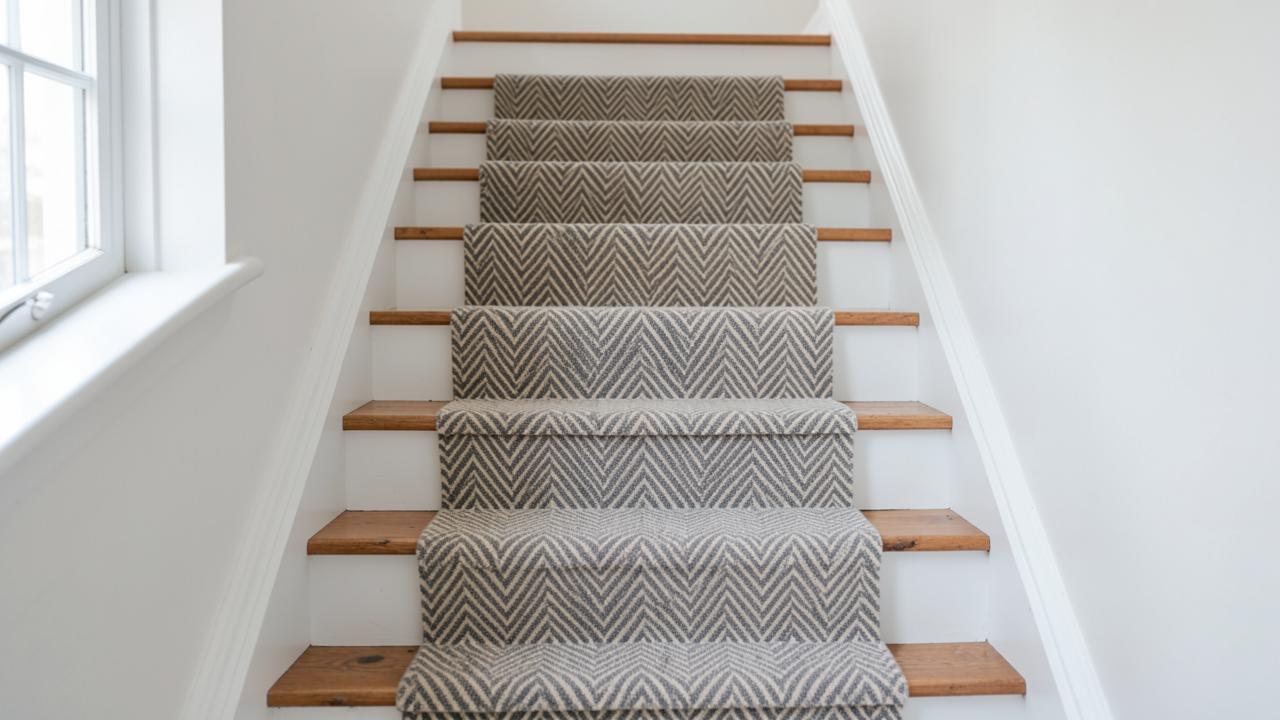 DesignStair Runner Patterns ExplainedHerringbone, chevron, stripes, plaid, geometrics and animal prints judged by how they behave on a staircase.
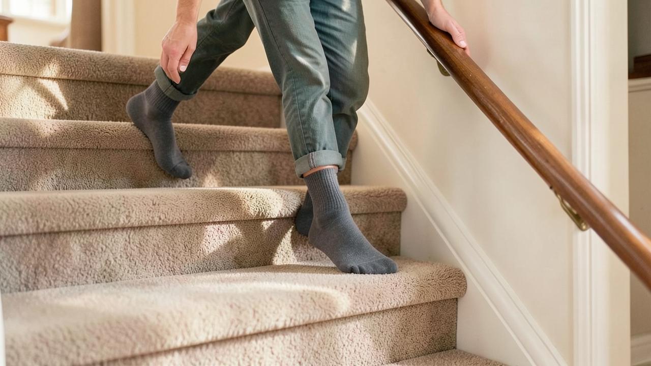 SafetyNon-Slip Stair Runners and Stair SafetyWhat actually makes a stair covering grippy: fitting tension, pile, pad and nosing coverage.
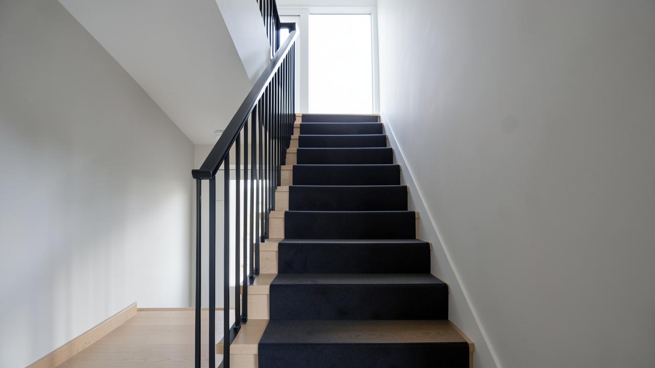 DesignModern Stair Runner IdeasContemporary, traditional, farmhouse and vintage directions, and what makes each read as deliberate.